9 Common Misconceptions about Users
Many website owners have persistent misconceptions about users, which could lead to a bad interface design and overall user experience. During meetings, when discussing new features or reviewing an existing one, website owners and managers often use their own experience and behavioral habits with a website to praise or shoot down the idea.
How many times did you hear someone say: “I wouldn’t use this feature so why are we implementing it” or “I use the application differently and I’m pretty sure the users do the same thing as me”? Sometimes it’s necessary to remind website owners and managers that we (including me) are not typical users of our own product. It is nearly impossible to look at it objectively because we’re using this product every single day. It’s time to get this and other misconceptions about users out of the world.
#1 Your users like having options, but hate make decisions
In this day and age of abundance it’s possible to get whatever you want whenever you want it. Do you need a new pair of jeans? Go to the mall or have a look online and you will find a few hundred of them. The choice is excessive.
This is where the paradox of choice kicks in. Although we prefer to have many options, like the color or fit of your new jeans, the overload of products makes your decision actually more complicated.
We also assume that the more choice we have, we would have better options and greater satisfaction. In fact, choice overload can make you question the decisions you make before you even make them. It can set you up for unrealistically high expectations and it can make you blame yourself for the failure.
Research has shown that too much choice can lead to:
- cognitive burden – the extra thought and effort required to compare the available options,
- post-decision regret – the fear that your decision might have been the wrong one,
- anticipated regret – where the fear of making an incorrect choice is so overwhelming that no choice is made at all.

Cognitive overload.
An interesting experiment conducted by Sheena S. Iyengar and Mark R. Lepper, called “When choice is demotivating: can one desire too much of a good thing” explored this choice paralysis. The experiment showed that people are more likely to purchase jams when offered a limited array of six choices rather than a more extensive array of 24 or 30 choices. People were also more satisfied with their tasting when presented the six choices.
Have the discipline to focus on the most important choices your users have to make and ignore the rest. Your visitors will experience a greater satisfaction.
#2 People don’t read all your content
They really don’t. In fact, 78% of people scan your digital content, looking for something of interest. The first two paragraphs must state the most important information. Some will go on and read, others won’t.
In 2006 Jacob Nielsen conducted eye-tracking studies which showed that users often read Web pages in an F-shaped pattern: two horizontal stripes followed by a vertical stripe.
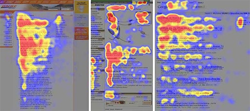
The F-shaped reading pattern by useit.com.
#3 Your website users don’t come through your front door
In many cases, the landing page isn’t the homepage. In 2012, according to Google Analytics, the homepage of this blog was actually in fourth place. My most popular pages were in fact the articles about the free ebooks, psychology of color, heat maps and responsive design.
Don’t put all your effort, time and money in optimizing your homepage.
#4 You are not your users
When working on projects and we stumble on problems, some coworkers or clients like to share their thoughts on how they would react to the problem as a “normal user”. Web Developers, Web designers and other web savvy people are not always our main target group and therefore not “normal users”.
Find a group of people according to your target group, put them in an office, present them the problem and observe their actions.
You want to know more about conducting Usability tests? Read my post “12 tips to improve your Usability testing technique“.
#5 Your users look to the actions of others to guide them
We have all noticed the ‘Customers Who Bought This Item Also Bought …’ section on Amazon (called Automated Collaborative Filtering – ACF), where we could see what other people have bought with regard to the current product being displayed.
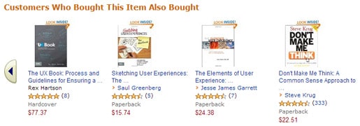
A second example is the ‘most popular articles’ section. In essence, it is a community of like-minded people who separate the good articles from the bad.
In these two examples people put trust in these recommendations or suggestions, which affects their future purchases or decisions.
For more information on ACF systems, read the paper titled ‘Explaining Collaborative Filtering Recommendations‘ (PDF) by Jonathan L. Herlocker, Joseph A. Konstan, and John Riedl.
#6 Your users are creatures of habit…
…, but that shouldn’t stop you from deploying that redesign you’ve planned. In the fall of 2009, Jon Wiley, lead designer behind Google’s homepage, came up with a simple tweak that he thought would have a major impact on user behaviour. He decided to make the search box wider.
This change wasn’t immediately apparent to all users, but once the tech blogs noticed, the negative feedback started hitting the web.
“Every single time I make a change to Google’s search there’s probably a group of people larger than my hometown (Austin, Tex., population 790,000) who are grumpy about it. But conversely, there’s a huge number, a much larger number of people, who are pleased by the change. (Although) maybe not initially.”
There’s a natural human inclination to resist change, but that doesn’t mean your new design will be rejected altogether.
#7 Your website visitors are impatient
The web is an unusual environment, high in cognitive friction, which is caused when tools behave in a way that seems unrelated to what you wanted. Furthermore, visitors are often distracted, multitasking, and focused on finding one specific tool or bit of information. When information, sections or pages are badly structured and the ease of use is very poor, visitors become impatient, resulting in a drop-off.
According to some tests, a website has 50 milliseconds or less to make the right impression.
The Nielsen Norman Group published an interesting article regarding response time, in where they explain the 0.1 second, 1 second and 10 seconds limit rule.
#8 Users will click more than 3 times…
… as long as they feel they are making progress towards their goal. The amount of clicks was for a very long time an internet fallacy, especially in e-commerce. Although buying a product and finalizing a purchase should go quickly, it’s more important that people see the progress they’re making and that the flow of purchase goes as smooth as possible.
If they feel lost, unsure what to do or need to think too much, they will leave.
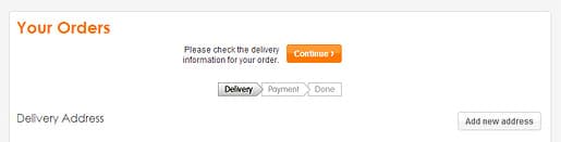
Buying a product and finalizing the purchase goes pretty smooth on Play.com.
#9 People hate scrolling but do it anyway
When users are asked, they say they hate scrolling. In real-life however, people often scroll without even realizing they are doing it. Many heat map studies, such as the one conducted by Clicktale, have shown that people do scroll through the interface to continue reading.
Although people weren’t used to scrolling in the mid-nineties, nowadays it’s absolutely natural to use the browser’s scroll bar.
Keep in mind however, that content above the fold will still get most attention and is crucial for users in deciding whether your page is worth reading or not.
One very well-known article on the matter is written by Paddy Donnell and is called “Life, below 600px“.
Conclusion
There are many ways to deal with these misconceptions about users. Market research, focus groups, usability testing, heat maps or even surveys could be used to understand our users better, knowing what they want and act accordingly. This is a significant step on the way to a good user experience.
Do you know any other misconceptions about users? Please share!


Users are often treated like sheep or dogs.
I always say thay are more like cats: you need to satisfy their needs or they leave.
believe it or not there is even a UX video with cats: http://www.youtube.com/watch?v=dln9xDsmCoY
Great article.
Hi Claudiu,
the video is great :-) Thanks for sharing!
I guess one thing for me as a developer is I assume almost everyone has a mouse-wheel/uses gestures for scrolling, therefore convincing me scrolling is not a chore. You mentioned “using the browser scrollbar”, do people really drag the scrollbar? Are there any studies/research actually supporting my thought or am I just making this up for my own benefit?
Oh gosh, #8 (Users will click more than 3 times). I can’t tell how many times I’ve given ‘the talk’ about research and willingness to click as long as they’re confident about making progress…only to have stakeholders sit back and say, “Ok, so tell me the plan to get us to the ‘2 click strategy'”.