Responsive Design: Hype or Solution?
They seem to love it in the US. Many blogs write about the latest trend: Responsive Design. With the arrival of smart phones and tablets, this is a logical solution for those who do not want to invest in various versions of a website for all those different devices. This phenomenon also starts to appear in the Netherlands. Is responsive design a keeper or a temporal hype?
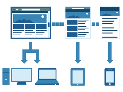
Responsive design is a solution that uses a flexible grid. Depending on the screen resolution, blocks of content are positioned differently on the page. Content remains the same and should therefore be written concisely. Mobile is leading so long poems aren’t appreciated any longer. Sounds good right? You are ready in a jiffy, you keep your money in the pocket and you still serve all your visitors the page they need.
“Responsive Design” by Guillermo Garcia-Mont
Since the enormous growth of mobile Internet traffic, a company can no longer stay behind and offer your visitors a slow website the size of a postage stamp. Using Flash seems to be a disgrace. Less is more, HTML5 and Internet Explorer lower than the 9th edition doesn’t count anymore. Grids already existed, but responsive design takes it to the next step.
Is responsive design really the solution for all media?
A few years ago, when all of us still had 800 × 600 screen resolutions and you were the exception with a 1024 monitor, a new trend was born in the US and heading our way: Liquid Design. Everything kept in place but blocks of content were scalable in width. You had two things for the price of one and your visitors weren’t dependent any longer on their screen resolution.
Once the monitor prices dropped, everyone changed their big boxes into beautiful widescreen displays. Liquid design disappeared rather quickly because it wasn’t necessary anymore. What’s the use of a liquid design on a 1920px screen?
Right now we are in a similar transition. We are faced with an enormous variety of screen resolutions but responsive design offers itself as a solution.
Mobile determines it all, or not?
I mainly create corporate websites which are in fact ideal for the responsive design concept. But can I explain to a customer that text should be limited to two Post Its? Do customers want to show their content on a mobile device in the first place? Does the user interface of a mobile website deflect from a standard website? For example, a main navigation could be three layers deep but does it fit the mobile version?
To know the answer to all these questions, you need to focus on the mobile aspect of the story. The motto “keep it simple” is applicable to all devices, including the mobile ones, but some need a different approach than others. The result should be the same though, simple site structures for easy navigation.
If I look back to some of my recent websites I imagine how blocks would move if it were responsive designed websites. Call to actions are placed, for example, on the top right side (much like our subscription buttons on this page) which will then automatically move downward. Is this truly what I was looking for because they were placed at the top of the page because we find the important. Another design shows four large blocks next to each other, each equally important. That is a bit of scrolling on a mobile phone when these blocks move underneath each other.
Responsive design is based on simplicity. Simplicity that we were able to let go its course due to the development of the web-technology. Desktop websites and mobile websites are not the same. Anyone who likes a bit of user interface design, won’t see a solution into responsive design just yet.
Other good reads on responsive design were published by Golden Grid System, Emerce (Dutch) and A List Apart.
What are your thoughts on responsive design?

What you should read next


To be honest, I love it because it allows me to be less annoying to a wider variety of users. I don’t think it is a universal solution, but some markets, like the one I am currently in, depend on it. The solutions are data based, so the ability to get them easily from any source or device is a prerequisite. So the designs can be simpler, and cleaner, while allowing for a consistent user experience.
When I worked a large e-commerce company, it was the same idea. If a customer could be at a brick and mortar store and look up the product they wanted to buy there on my site and see reviews and feedback on it as well as a different option for pricing, we might get a sale for that purchase that we wouldn’t normally get. So if the experience between their mobile experience and their desktop experience are similar, there is less of a learning curve and it gives the feeling of being easy to use.
I also think that responsive design also forces designers to make sites that are clearer and easier to use. Sometimes at the sacrifice of the art and design, but sometimes it keeps the site from becoming a really beautiful mess.
So like everything, it has its merits and is an important part of web design right now. It is not universal and not always the best solution, but I have found that the companies I have worked for have had a lot of success by making their sites more responsive. But I am sure there are probably about fifty people that have excellent arguments debunking everything I just said. Or stopped reading after the first excruciatingly long paragraph…
Usability is a measure relative to three things: the user, the task and the context. If the same user wants to accomplish the same task in a different context, for example: on his cellphone in a bus -as opposed to sitting on his desk in the office- he might find that the usability of the interface is different. So that’s a theoretical way to dismiss responsive design as a solution.
When the user in commuting, he might want to know his tasks for the day, but when he is in the office, he has a different goal, like working on a presentation for instance.
So the context changes how relevant things are, which goals the user has, and affects the interface he needs, in this case, responsive design is not the sollution, ‘cos you don’t want to send the same content.
From a systems design point of view, it’s a perfect sollution, it allows you to send the same code to multiple devices and having it work perfectly. But we still need device fingerprinting on the server to chose how much content we send to a device with a limited bandwidth and small screen size, this way we could also change the positioning of menu items to reflect mobile tasks.
Every new website we’ve built lately has some component of responsiveness to it. When done right it really can be effective.
Where I work specializes in more or less corporate sites as well. We bring some design consideration into the responsive realm by thinking more about the mobile context. Why would someone pull up a company’s website on their phone? Answering that question allows you to keep the most valuable mobile content and take away pretty much everything else using our old print-stylesheet friend display:none. So those extra blocks you mention likely wouldn’t even show up for mobile users. Nor would some full sections of content be available in the mobile navigation as contextually speaking, a company phone number and address are much more important to someone on the go than those annual reports tucked away in the about us section.
Ideally we could build another site just for mobile and save some Ks but sometimes budget constraints or timelines just don’t allow it. We focus on our local Calgary market where oil and gas companies are tightening their belts more and more. For those times going responsive + thinking about context is a nice tool too have at a web designer’s disposal.
I could be oversimplifying, but I don’t see how it can hurt to build a website or webapp to be responsive as a standard — especially if you provide the option for users to “View Full Site”.
The only issue with responsive design, as I have read a few times, is the additional time and development hours. I think many of those hours can be resolved in the planning and design phase by designing with responsive elements in mind, but it is most likely always going to take a bit more time to make a site that works everywhere rather than a site that works for one general standard.
Ultimately I think it is worth it because I am an edge case warrior, but to be honest, I think developers and designers have to look at the scope of what they are doing, their budget and who their audience is before figuring out how responsive their site is going to be…
Thanx everybody for leaving your comments and opinions. It’s nice to read cause I’ve written this article in Dutch for my own blog and translated it for Paul’s. It was especialy for the Dutch about the things I see changing.
I think that our market is different than the one of the United States. Our customers don’t expect a simplified web design so we can use it for responsive. They think, why should a serve a simple website so I can serve mobile users?
Mobile is still a little child here so people doesn’t see the importancy right now. I really hope it will change fast cause I like doing stuff for mobile. I’m great fan of mobile websites instead of webapps or native apps. But I also think that the UX of mobile is completely different than a amaller version of a website with responsive design. We have different kind of operating systems within their own differences like having a back button or not. And do I really want to serve the whole website to users. Do they really want to see every website page on their mobile screen in a smalle responsive web design.
Study learned that mobile users have a quick way of scanning their information. So I prefer a best of the rest mobile website. With only the important things. Maybe if companies use Twitter a lot, you need the larger version. Its dependable the way companies communicate.
So if I have to choose where my additional hours are going to, I rather would design a simple mobile website with a nice tabbar and some special mobile things instead of responsive. Cause mobile users a different.
I guess I can write a lot more about mobile. Maybe enough for a new guest blog. I liked the discussion and why you think reponsive will work.
I agree with your passion to build a website that looks nice across all platforms. Even here in North America we have major retailers that supply a different website for mobile users and you can’t bypass it and go to their main site. They end up having a watered down version of the website that typically doesn’t have what I’m looking for.
Their normal site showed up fine on my iPhone so some slick sales person told them this was the way to go. So some companies could still use your post over here too! :)
Nice article!
Indeed, different type of users, different tasks, different context of use and different hardware all demand a different kind of usability.
You can’t fix that one with Responsive Design alone.
Mobile internet is rather expensive here, but one of the others reasons mobile is running behind in Belgium and The Netherlands is due the weak mobile usability.
Responsive Webdesign is what we’ve all been waiting for. Actually it’s kind of strange that it took so long when you come and think of it. We at Studio Stomp are very excited about it, trying stuff out all the time. It’s a bit of a mind f@#$, I think. I keep asking myself, why haven’t we thought of this our selves, many years ago, what the hell have we been doing?! After this daily self punishment it’s back to excitement. Reading, philosophizing, talking, what does this mean for our process, what are the implications for native apps, how do we sell it to our clients. And some 1000 questions more (love the mobile 1st approach! by Luke Wroblewski). My new love is Responsive, you can love her too.
I have been considering the benefits of responsive design and I am unconvinced. The capabilities of modern mobile devices means that they can render well structured websites perfectly well and the user gets the full expirience.
Even with the best examples of responsive design I have seen, I feel cheated by the mobile layout on my iPhone.
Bad websites are generally bad on whatever device you view them on but I am generally not disappointed by good websites when viewed on a smartphone or tablet.
Now if responsive design offered a solution to bandwidth detection i.e the mobile device is using 3G rather then wifi that would be different!
It’s better than nothing, I guess. I personally hate browsing some websites in my smartphone while it still showing annoying content such as your ‘Social share button’ ans many other thing such as sidebars. I just want to read the primary content and that, my friend, where responsive design come approach …
We just launched a client site using responsive design: http://www.michigan.org and it was great for the client. The state of Michigan is the #1 ranked travel/tourism site of any US state and they chose it as a solution for mobile visitors, tablet, desktop visitors — and so far, it’s a hit!
I agree with a lot that was mentioned here. Mobile devices are becoming more and more important rapidly. And responsive web-design will be as important too for most websites. Most companies can’t afford to build a special website for every device size.
Responsive design (in a more general sense) can be done differently. And there are different names for it: Fluid Design, Adaptive Design, Responsive Design and Server Side Components.
When using responsive design with a flexible CMS like Drupal these possibilities can be combined and e.g. it can be designed which blocks apear on which device (or screen width) and in which place. So we can provide a suitable screen layout for every device type without doing much additional work. For my Drupal website http://wwww.ksi-cms.de I used some of these possibilities.
Is it really necessary or even useful to create a “responsive” version for tablets? Personally it annoys me to not have everything in the same place like when I am browsing on my desktop, and I have never had problems with not-responsive websites on my tablet.
Smartphones are a different category, not just because of the screen size, but also because people use them differently than tablets and desktop browsers. So it may also be a content driven choice to make a separate mobile site and not a responsive site.
I suppose that can also be done within a responsive site, but I am wondering if that is really more economical in terms of calls to the server, extra css, etc. Wouldn’t it be more effective to just separate the two types of sites from the start? At this point I still don’t see any important advantages of using responsive design other than impress your clients.
To Marc’s point, I think that the point of responsive design is not to design for tablets per se, but create a design that works for any screen size or resolution. The term Tablet is just associated with one common size, but responsive design is about providing effective solutions for future resolutions and screen sizes as well.
Mini Tablets are a prefect example. While you can want the exact same experience on all size screens, setting up break points in your code to add small to significant style changes that best fit that device is the important part. If that break point happens to be 1024px great! But it might actually be 937px and that could be for any number of reasons ranging from readability on a smaller screen size to a more aesthetic padding size on a smaller or larger screen.
Retinal Displays are another thing that have to be factored in. So rather than thinking of responsive design in terms of being a similar or good experience for each of the known resolutions and screen sizes, make it about creating the best possible design for whatever screen size or resolution might be viewing your site.