How Color Influences User Experience
Colors have a very profound effect on the usability of websites and apps. A poor choice of color influences the user experience in a negative way and may even make the app or website unusable. The topic of color is rather subjective, but the information here features the most commonly held thoughts and opinions of people in Anglo Saxon countries.
Color saturation has a deep effect
How much gray a color has in it will affect how concentrated and saturated it appears. Saturated colors are thought to be dynamic, attention grabbing and exciting. They often slow website and app users down, which is why they are commonly used for links, alerts, message systems and buttons.
Desaturated bright and dark colors are often used for panels, background and menus. The main reason is that they are not attention grabbing and will not interrupt the users’ concentration.
Bright desaturated colors are considered friendly and professional, especially when gradated. Darker desaturated colors are also seen as professional, but also as more serious. (UX Movement, 2010)
Usability and color are linked in terms of app and/or website function
Websites and apps are seemingly easier to use if the correct colors are chosen. This is not true if the colors make text difficult to read, but is true if the website or app uses color coding. Colors may be used to separate and highlight different sections, categories and functions. They may also be used to indicate the priority of a function. Attention-grabbing colors to indicate high priority functions, and neutral colors to indicate lower priority functions. (Shneiderman, & Plaisant, 2005)
Color may also be used to suggest the severity of a function, such as using red to close an account or delete something, and using green to suggest the addition of something. For example, a content management system may highlight the delete button for widgets with a red color. The “add” button can be highlighted for widgets with blue or green colors. (Shneiderman, & Plaisant, 2005)
Customer Satisfaction Is Not Influenced By Color
The link between user satisfaction and things such as usability and appearance are not as closely linked as once thought. If different people are exposed to different websites, they rarely consider the color to be a major part of their user satisfaction. This even includes when the website is mixed up or flipped such as the images below.
The user satisfaction for all the website designs below were all the same. However, when different people were exposed to all four website designs, they chose the ones with the most pleasing colors. It was being perceived as the easiest to use and they therefore better than the others.
In other words, the better the color choices, then the higher the “perceived” usability of the website, even though in real terms the usability was not affected at all. (Shenkman & Jonsson, 2000), (Lauer & Pentak, 2002)
Lavish colors suggest a higher quality interface and/or design
Websites with simple blocks of color are seemingly acceptable, but are often considered to be of a lower quality. There are exceptions to the rule, especially regarding websites, but even a little graded shading helps make a website look a little more professional. This is especially true when it comes to apps, where lavish and most complex colors suggest that the app is of a higher quality because it looks more professionally made as opposed to designed by an amateur. (Ballard, 2007)
How colors commonly make people think and feel
In Anglo-Saxon countries, i.e. countries where English is the primary language, people consider colors in the terms listed below. There are numerous opinions that vary from culture to culture and person to person, which is why the list is rather mixed and sporadic. The list also features common psychological effects and/or real-world associations.
The links, attachments and associations listed below are only representative of what people in certain Anglo-Saxon countries think and/or feel, though there are countries where many of these associations are also present, such as Japan and Russia. (Kar, 2013), (Izzo, 2012), (Khudeira, 2014)
With regards to how people think and feel, there are studies that show even countries brand their websites with their national colors to encourage a link between their nation and the website. Brands do this all the time, and you will find a great many websites feature (at least in part) the same colors that are linked to them via their brand.
The most popular brands to seemingly abandon this are Nike (a black tick) and Apple (White). However, Nike uses a lot of white space in order to make their tick stand out, and Apple actually use white as their brand color, and they have done it so successfully that most consumers cannot associate a color with Apple (except white). This was not true as recently as 1998, which people associated a rainbow of colors with Apple. (Barber & Badre, 1998)
Red
This color represents danger or an action that may have a negative effect. It may also be used to draw attention to something. Some associate it with blood, sex and debt. Red is sometimes associated with confidence, and many times is used to highlight things of importance.
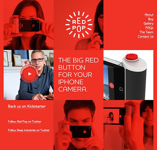
The people of Red Pop gave the main characteristics of their product, which is a camera button, a red color. The website and merchandise soon followed its example.
Pink
It is often associated with femininity the tone is lighter, and is associated with sex and sexual aggressiveness when it has hotter hues. Its link with sexual aggressiveness may also be linked with confidence. It is also linked with a youthful energy and certain tones are associated with nurturing, selflessness and love.

Orange
This color is often associated with energy and vitality, and research suggests that older people respond to softer hues whilst younger people respond to bolder tones. It is linked with happiness and positivism.
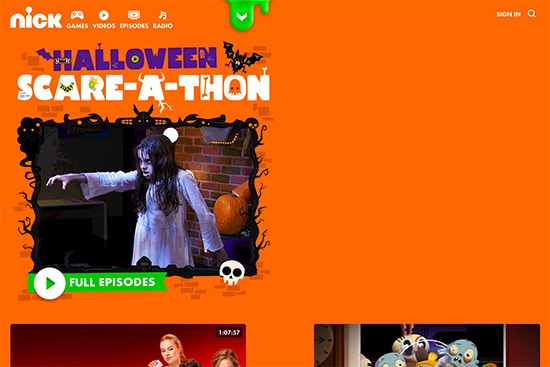
An example by the Nickelodeon team. They have used bold colors and tones with their website targeted at energetic children.
Yellow
A bright and bold yellow may be associated with energy, alertness and happiness, whereas a lighter tone is associated with confidence, optimism, contentment, confidence, clarity and good judgment.
In general, bright yellow stands for happiness and joy; while pale yellow gives a sensation of calmness and tranquility.
Green
This color is often linked with feelings of calms, nature and comfort, but darker tones are often associated with wealth. Many associate it with nature, but tones with a hint of blue are often used to represent illness and nausea.
Blue
Honesty is often linked with a strong and darker tone of blue, and some associate it with authority. Many consider blue to represent coldness or think of it in terms of a lower temperature, which is also why darker and more grey tones may be used to represent depression. Some feel that certain blue tones have a calming effect due to their link with the sky and sea.

This website almost makes an audible plea to be respected and to project its authority.
Purple
The color purple is sometimes associated with fear and combat shock, though it is often thought of in terms of cleansing peace and purification. Many consider it in terms of beauty, intuition, compassion and imagination. Darker tones with a hint of blue are thought to represent nobility and even royalty.

Brown
This color is often linked with stability and even reliability. Many people consider it to be an earthy color with all the associations that brings. Some link the color with a feeling of security, and certain tones are often described as dirty colors and/or waste colors.

The UPS delivery company want people to think of them as reliable and stable, so having their logo and their website in brown is a no-brainer.
Black
Many feel that black is a comforting and protective color, though many also feel it is a depressing color if used too much. Black is often thought to be sleek and fashionable, but it also has links with death, silence and mystery.

White
This color is universally linked with purity and clarity. Some people consider it to be a cold and isolating color, and many app and website users do not consider it to be a color unless it is shaded/toned with another color such as gray.
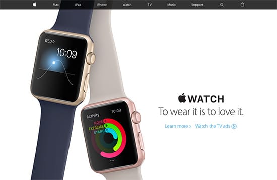
Apple uses white a lot to help get away from their past and come across as a newer and more purer company. However, they are often using very light shades of silver and grey to give their whites a little more depth.
Gray
Some think of this color in terms of gloominess and many feel that this color represents a lack of color, despite the fact that black or white should be considered in that way. Grey may also represent self-reliance and independence, as it is usually linked with age. Many think of it in terms of a lack of involvement or loneliness.
Conclusion
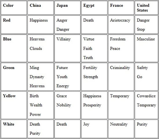
The colors listed above are only a snapshot of what people in places such as the US, Canada, the UK, and to a lesser extent Australia, think about colors. The reason that these countries have such similar opinions is their deep historic link with the United Kingdom, and the effect that the US movie market and popular media has had on those countries. Below is a small table showing what people in other countries feel about colors. (Barber & Badre, 1998)
Though color is important, especially with branding, you must remember it is only a small part of a bigger puzzle that is your website or app design and its subsequent usability. Do not get too hung up on colors in terms of trying to achieve a goal such as looking rich or energetic. Instead, concentrate on usability and avoiding the negative effects that poor color choices may have.
Resources
- Ballard, Barbara. Designing the mobile user experience. John Wiley & Sons, 2007.
- Barber, Wendy, and Albert Badre. “Culturability: The merging of culture and usability.” Proceedings of the 4th Conference on Human Factors and the Web. Vol. 7. No. 4. 1998.
- Izzo, Jean Karl, 2012. Color: User Experience And Psychology – Usability Geek (Usability Geek)
- Kar, Ashley, 2013. Interactions (Color and user experience)
- Khudeira, Safa, 2014. Color Psychology 101 – How Color Affects Perception of Your Website (The Intechnically Savvy Blog)
- Lauer, D. A., & Pentak, S. (2002). Chapter 5: balance. Design Basics. (pp. 75-98). Australia: Wadsworth.
- Shenkman, B. O., Jonsson, F. (2000). Aesthetics and preferences of web pages. Behaviour & Information Technology, 19(5), 367-377.
- Shneiderman Ben, and Catherine Plaisant. “Designing the user interface 4th edition.” ed: Pearson Addison Wesley, USA (2005).
- UX Movement , 2010. How Color Saturation Affects User Efficiency
Still not sure whether we can shape the user’s experience? There are countless examples, even in menu cards or pricing tables, that are designed in a way to guide your decision.


No responses yet to “How Color Influences User Experience”