Google Prioritizing Mobile: A Shift in Thinking About Websites
With more than 60% of Google searches in 2016 coming from mobile devices (smartphones + tablets), it was only a matter of time before the search engine giant move towards that direction. In hindsight, it’s no secret that before the year ended, they rolled out their mobile-first indexing.
It favored those with a mobile-responsive website, and signified a massive focal shift for marketers and web developers. Optimizing sites have a new target on mobile traffic, which only grows as time passes. And with a new target comes new priorities for your website, SEO strategy and user experience.
A Shift in Thinking
In order to explain how mobile-first really affected the landscape of website building, let’s go back to the days of mobile-only websites. If you were there in the beginning, you would have seen domains like “m.website.com”. This is a mobile-only site, and it was a nightmare to maintain. Companies had to create several versions of the website, and with so much to maintain, mobile-only sites soon crumbled from lack of updates.
Then back in 2010, responsive web design was born and websites were ushered to a new age of simple code-construction to accommodate the increasing amount of devices that people use. The challenges, however, didn’t stop when websites responded to a user’s screen size. Mobile responsiveness required a shift in context, and with a small screen to work on, people had to have access to the information they need.
From there, developers and marketers got better at addressing issues for mobile users while maintaining the same experience for desktop users. Now, we expect websites to be responsive to any mobile device we use, and when they don’t, it creates a bad perception. This is a primary reason how mobile-first indexing will affect your websites, among other things.
The Present and the Future
At this point, if you don’t have a responsive website, you’re not just late to the game. Google hasn’t officially rolled out the mobile-first indexing. But it’s 2017, and if you still haven’t done anything to make your website mobile friendly, you’re walking to your own doom. They also no longer show desktop results for mobile searches. Whatever industry you occupy, you’re losing a lot of leads in not prioritizing mobile users.
This is why optimizing your site is your first protection against tanking on Google’s mobile SERPs (Search Engine Result Page). Mobile users expect the same experience from the desktop version of your website, so improving your page load speed, creating better structure and flow, using longer title tags, and robust linking are your pressure points. Executing these tasks not only create a stable user experience, you may even get a ranking boost from Google since these are search-friendly properties.
What Does Design Look Like in a Mobile-UX Ecosystem?
In an ecosystem where you need to maximize the small real estate of smartphones and tablets, plus you need to provide a good user experience, design is where these two come to a head. These last few years, there have been shifts in how to render design on mobile screens. But in preparing for Google’s full rollout, it may be smart to look towards the future of UX design.

Focus on the product – Many times, it’s the product that’s the centerpiece of a web page. So when it should command the whole page, why not give it the whole page? It should be easy to navigate for users, and you can always add simple functionalities so you can still maintain focus on the product.
Timeless designs – There are many ways you can achieve a timeless design for your website. If you can align it with your brand and the functionality of your site, you can develop a design that never gets old. The user experience will be consistent, and when you have that kind of baseline, it’s easy to pinpoint your weak areas.
Specific functionalities – Flipboard is the ideal example of catering to its users perfectly. Its pioneering design, reading-specific functions, and several customization options make it a joy to use. It’s possible to integrate these features into your mobile website, and UX and your service will be better off with them.
Preparing for the Coming Changes in 2018
We’re still waiting for the sweeping changes that will happen once Google fully releases the mobile-first index, but don’t wait around until you see bad things happen.
One of the best things you can do right now is perfecting your desktop site. Ironic, right? This means that once you focus on your site’s mobile responsiveness, you don’t have to worry about your desktop site under-performing or halving your attention between the two.
If you do have a responsive design, then you’re past the first hurdle. You, then, need to ensure that you’re doing everything with a purpose. Here are three things you can do to guarantee that your website will deliver the best user experience on a smaller screen:
Know your audience
Google Analytics will help you create an image for your mobile users, down to the device they use and the OS of their smartphone. It will provide you a treasure trove of actionable knowledge for your mobile strategy. You can also interpret the metrics to improve your site’s performance. Data is everything.
Balancing your desktop and mobile content
Your website copy won’t all translate into your mobile version without a few adjustments. Since the real estate is smaller, and you need to show the most important information, you need to plan which content you need to show. You can also use drop-down menus and accordion boxes to avoid showing everything all at once.
Testing responsiveness with Google’s tools
There’s no better measure of your success than a test, from Google no less. Test My Site provides feedback about page load speed. Most sites lose a huge chunk of traffic while loading, so this can help you address a major problem early. On the other hand, PageSpeed Insights generates actionable knowledge about the weak points of your website.
Examples to Follow
There’s no shame in using popular, well-made mobile website designs as your inspiration. Any app in Google’s software suite is a fine example, but Maps stand out in combining form and function in a clean manner. Whether used in Android, Apple, or as an app, it’s fast and using it means no fuss.
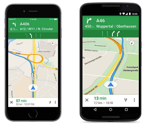
Google Maps on an iOS and Android device.
BuzzFeed’s mobile website is content abundance done successfully. The experience is smooth despite the stacked style of the content, not to mention that they always go for the viral stuff. So it’s trendy, easy to use and colorful; no wonder they’ve been used as an example of a modern website done right. Huffington Post’s mobile site is also made in the similar vein as BuzzFeed’s.
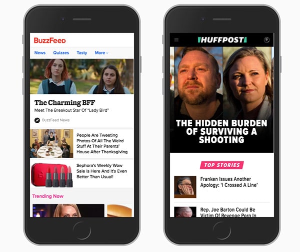
Buzzfeed and The Huffington Post side by side.
Typeform’s desktop website is something simple and beautiful, and they’re able to do the exact same for their mobile website. The design is simple, the buttons are large, navigation is easy, and everything is visible. It’s such a pleasing website to use, much like the way they do data collection.

Typeform is an absolute pleasure to use.
2017 is ending, but everyone will be ramping up the pressure to make website ready for the mobile-first indexing. It’s never too late to catch up, and by research, trial and knowing your users, you always have a basis on how to execute your mobile-friendly website.

What you should read next


The desktop computer is being phased out and will probably amount for a small percentage of use in 5-10 years compared to mobile / android / ipaid devices. As a web developer this frustrates me because great effort has been placed in optimising for desktop both in design and SEO.
If you’re designing your website , perhaps it’s better to inspect in ipad sizes devices and desktop as an after thought. Unfortunately I began designing the PureLocal directory when desktop was still 75% of device use. Time to move with the times.
I completely agree about the importance of mobile responsive website. For organic search presence, Google takes it as a top priority when it comes to considering UX signals for SERP ranking.
In fact, Google has already rolled out Mobile-first algorithm, which prioritise mobile responsive website for indexing.