6 UX Strategies to Include in Your Mobile App Development
Once upon a time in 1983, when Steve Jobs was addressing the International Design Conference in Aspen (IDCA) he predicted a future where he said that Apple’s strategy is to “put an incredibly great computer in a book that you can carry around with you that you can learn how to use in 20 minutes”. Decades later, Job’s prediction was spot on!
The world would be a different place without all the mobile applications- chaotic and complicated. Contrastingly, the world is still a chaotic place because there are thousand of apps which ‘promise’ to deliver a better solution. Although there are a number of factors which constitute to the success of a mobile app, user experience (UX) has come out to be an undefeated champion.
Why, you ask?
Because if you look at the app store, you won’t miss out noticing one common thing among all five star rated applications – they all have been judged for an incredibly wonderful user experience. People swear by their ‘simple and intuitive’ design.
So what constitutes their arsenal?
Well, we can help you with a blueprint. Here are the six best strategies you need to implement which have always worked wonders.
1. Quickly pivot on new inventions
If you were born in the 90’s you would remember that when Nokia came up with the ‘Snake’ game, they revolutionized the way mobile phones were used. Apart from sending texts and making calls, users could have fun too. So after this invention, the competitors neither stopped nor resented. They quickly pivoted on this ‘innovation’ and grabbed the market with colorful animated user ‘engaging’ games.
So always keep a check on what’s trending in the market and quickly pivot your innovations in that direction. Because stories have been retold over and over throughout the ages – still some are just better than others. Beauty and the beast was made 4 times, each one better than the previous.
2. Do the minimal
If you are designing for a mobile app, the first thing that should come to your mind is – people are struggling and are discontented with their current solution.
Why?
Because your competitor choked them with a plethora of options on a 5 inch screen and now they are confused. So if you want to grab their attention, reduce that load of information, keep the navigation easy and let the customer win. Avoid adding causeless elements. No one will ever complain that your app is too easy to understand. The platter should fit the customer’s appetite. No more, no less.
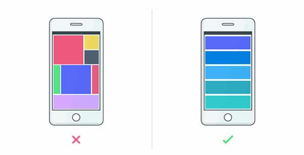
Keep it simple.
3. Don’t aim to shoot in the dark. Adopt mobile app UX Analytics.
If are looking to build great app and be informed about weather your intended goals/requirements are being met or not, become a fan of analytics (like the one Google Analytics offers) and start looking at the bigger picture.
Here’s a good example. Say, Google Analytics shows that a user is not able to register a new account with your mobile-app. So now you know where your users dropped off the ‘Signup’ screen. But is that a sufficient information? After putting so much effort in designing, would you not like to dive deeper into your user’s problems and why they couldn’t finish important processes (such as registration or cart checkout)?
Adopting UX analytics will provide you with a ‘why’ and the points of friction while interacting with the app. It will also provide you with touch heatmaps, i.e. where you are able to gain attention of your user or which call-to-action (CTA) button needs to be shifted a few pixels down in order to get user’s attention.
4. Design should focus on your users
You’ll only a few seconds to make that first impression after the user installs your application and starts using it. If your application is not intuitive and too complex to understand, chances are that user will uninstall it the very next moment.
So more than focusing on features, ask usability questions- should the app have access to GPS, cameras or any other specific function? Would it confuse/irritate the user if he is prompted for too many permissions? Am I using the correct app design layout? Where can my users face friction while interacting with the app? Is this font causing distraction? Which is more user friendly- horizontal swipe or vertical?
Work upon CRAP design principles to improve your visual appeal. Let user be the king. ‘Don’t-make-me-think‘ is what users want. Make their life easy. Do not miss out on influencing the emotions of user. Your primary focus should be on creating a magical solution for their problem.
5. Make the best color selection
Who doesn’t love colors? And a right color palette selection for your mobile app will make a huge difference if you want to impart a pleasing user experience. But with abundance of colors, the responsibility lies on designer’s shoulders to choose the right color at the right place. Especially when you are targeting a particular geographical location. This is because different colors have different cultural significance as you move around the globe. You know you can create emotions with colors in UX design, right? Well, if not then consider it as a parameter while designing the mobile app.

Make the best color selection.
6. Ease out on the user onboarding process
User onboarding is one such parameter which can harm your growth, if not your success. Look at it this way- you download an app which sells old books at a fraction of the original cost. Your book-worm self gets excited and you sign up. The mobile app looks uber cool, the design is great and account creation is allowed via multiple channels (Facebook, Google+, etc).
You are happy with the experience but just as you swipe right, they ask you for your credit card information. Now, why would you want to do something like that? “I don’t have a credit card. Can I go ahead, please?” your user cries.
Another user would first want to see what you have to offer and she is ready to give you credit card information only when she is making a purchase. How legitimate!
And this is just one example. There are many like collecting the right set of data, providing tutorials, app permissions. So you have to find a right balance between collecting information and collecting essential information and doing it without losing even a single user.


Thank you for these very useful tips. I will certainly be keeping your advice in mind when designing mobile apps for clients. Even in industry the user experience is key and can help increase efficiency for people working with custom mobile apps.