10 Psychological Principles that define your UX
User experience design is essentially a blueprint of a human being’s interaction with a machine. So no matter how smart or technical the machine gets, the user will always operate it with the human mind and the human mind has some fairly unbreakable patterns.
So here are 10 basic behaviors rooted in human psychology (psychological principles), that apply to any program, application or interface you are designing.
1. We want the shortest route to a destination
Our minds are programmed to take the easiest way possible and avoid hard work as much as we can. We want to get a task done with the least amount of effort possible. So, when designing an engaging UX, be sure to eliminate any tasks that aren’t absolutely essential. Every click, every touch, every letter of typing you can reduce is a possible win.
- Use smart defaults to minimize work.
- Automate as many tasks as possible – use form autofill, save passwords, smart syncing and anything that helps reduce effort, physical or mental
- Deploy progressive disclosure. This means, show them a bit of information, and let them choose if they want to see more.
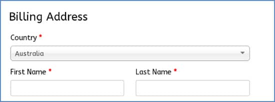
A default form entry is the answer that will be chosen by your maximum users and hence, can be a default. Do give users the option to change defaults though.
2. We want the option to go back
Incidentally, the back button is the second most used button in UX design. People want to go back all the time and a good UX design should help them to return to the previous page smoothly.
The concept of the previous page is also a tricky one. The user wants to go back to what they think was the last page (or last step). That doesn’t necessarily need to be the “technical last page”.
In overlays and accordion style checkouts for instance, users just want to go back to the previous field entry whereas the back button takes them back to the last url. In that case, the user would lose any information he or she has already filled out in the form. This is usually enough frustration to abandon the site.
Make sure you design your back button to take users back to exactly where they want to go, even if it is a section of the same page.
3. We get bored pretty quick
Just the sight of a big chunk of text is enough to make your users reconsider staying on your page any longer. There is only so much people can read and try to process before losing interest. Unless it’s written by JK Rowling, try to keep too much text away from your UX and use small, easily scannable lines instead.
- Use clever copy that explains but in a conversational, anti-boring tone.
- Provide examples/pictures to show how something is done.
- Use video tutorials if something needs explaining. Text tutorials are a drag/
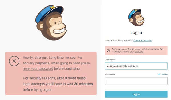
4. We make mistakes, but we hate being pointed out
That intimidating red message – not only blocking users from proceeding but also pointing out their mistakes – can be quite a deal breaker. There just simply has to be a better way to deal with errors.
Try to prevent errors from happening at all, by observing the most error prone areas and modifying them to make them simpler and more predictive.
- Make it easy to ‘undo’ a mistype or misclick.
- For important decisions, ask for confirmation before going through.
- Break up large forms into smaller chunks.
- If there are errors that you can correct, do so, and show what you did.
Even so, error messages are avoidable. So find better ways to communicate them.
- Make them very specific and point out exactly what needs correction.
- Use polite and sometimes casually friendly language instead of a mechanical tone.
5. We don’t multitask well
Studies have shown this time and again. People simply do not want to do too many things at once. Focus your UX on one task at a time. Preferably, one page should only require them to do one task and no more. Similarly, they should have to process just one chunk of information at a time and take one action at a time.
6. We have trouble remembering things
Blame it on mobile phones becoming a part of our body, but we really are using the phones to replace our memory. Users today have trouble remembering more than two phone numbers and hardly ever remember a birthday unless Facebook reminds us.
- Intuitive UX design should help users by remembering for them. It should store important details and not ask for the same detail twice.
- Important details like product price, event date and deadlines should be clearly visible from all pages and the user shouldn’t have to go back and forth.
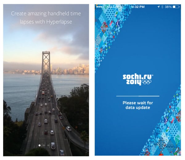
7. We go with what grabs our attention, not necessarily what’s good
While quality is and will always be the ultimate virtue, the power of attention simply cannot be ignored. Bright colors, rich graphics, catchy headlines, whatever grabs more attention will be the first thing that the users click on.
So even when you are primarily relying on the quality of content you are providing, work hard to grab the user’s attention first.
Hyperlapse on the left clearly states the benefits to entice users and get them to try out hyperlapse at once. Sochi Winter Olympics app on the right however, took long enough to load and came out with a hard-to-read font and revealed nothing about what this app did or was going to do.
8. We want more options, but not too many
The famous Hick’s law has roots deep in the human psyche. People think that they want to see as many possible options before they can zero in on one, but really, too many options only confuse them and make it difficult to make a decision.
The famous jam experiment proved it well enough for us all and we’ve all felt the same too when we go shopping, or grab a restaurant menu with too many items.
So be extremely careful when presenting the users with options. Be sure to give them enough options but don’t go overboard.
- Group similar options together by category.
- Eliminate all unnecessary options.
- Keep options relevant and focused to user behavior.
- Use collapsible questions where sub-questions appear only after the key question is answered ‘Yes’.
9. We rely strongly on visual patterns
There’s a reason the line ‘what you see is what you get’ gets tossed around so often as a mark of honesty. Visual reinforcement is still by far the most powerful instinct. So instead of informing users through plain text, use strong visual reminders to drive your point.
- Design clean interfaces with clear focus points that guide the eye.
- Use proximity compatibility – group similar objects together.
- Use colors well.
10. We are social creatures
Even before social media existed, people simply loved to go out and meet other people. It’s just basic human nature. Now with social networks being a way of life, social sharing takes on a new meaning and significance.
Your users will want to reach out to their friends, family and peers whether they are buying an outfit, booking a holiday or simply watching a video. Account for this basic need and be sure to include easy social sharing in your UX design.
- Allow social sharing without leaving the page.
- Allow interaction with friend groups where complex decision making is involved. Shopping sites with chat features is a great example.
- Integrate camera and photo sharing.
Conclusion to our psychological principles
No matter how tech-savvy we get and how sophisticated systems we develop, humans will be an emotion-centric species and the basic characteristics of the human psychology will always underline the most pragmatic of our decisions.
These psychological principles highlighted above are pretty nearly universal and must be carefully considered and applied no matter what kind of program you are designing. Appealing to the user’s emotions is the only way to get your point across effectively and making them take the action you want them to.


No responses yet to “10 Psychological Principles that define your UX”