Three Ways to Deliver Exceptional Mobile User Experience
We’re living in a multi-device (ideally a mobile-dominated) world. And so, if you’re still focusing on improving your website for desktop users, then you’re likely going to lose a lot of potential opportunities to increase conversions. The use of mobile devices – be it for searching things, purchasing products, etc. – is booming.
But an unfortunate reality is that many site owners are yet to adopt best practices to deliver exceptional experiences to mobile users.
This post is intended to provide you knowledge of certain ways that can help you in improving mobile user experience (UX).
1. Design Keeping The Need of Mobile Users in Mind
The very first that requires your attention is creating a design that address your mobile users needs in the best possible manner. Each user navigate across a website via mobile devices in a different way compared to desktop systems.

According to Google’s research on mobile website usability sessions, it was concluded that mobile users are goal-oriented. They expect to access information they’ve been searching for on a mobile website instantly, based on their own terms. Furthermore, the research also focused on creating website design without impacting the quality of content. In essence, when developing a website design, it is very important to ensure that it can help users get what they need, immediately.
However, the desktop version of your site can frustrate users. By asking them to perform pinch-to-zoom motion on small size devices, as you can see in the image below.

Pinch to zoom on small devices.
To address the need of mobile users, you’ll need to create a design that best suit their wants. For this, you’ll have to analyze the amount of mobile traffic coming to your site. And based upon that, you may find that whether you want to build an app or a mobile version of your site, or both.
For example, Sweet Leaf Iced Teas website does an excellent job. Move its desktop users to the mobile optimized version of the site easily, without the pinch and zoom effect.
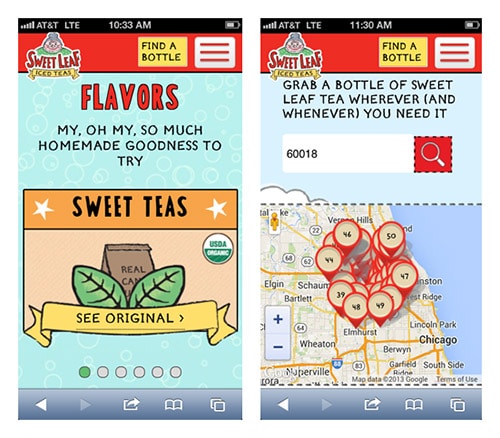
Sweet Leaf Tea website.
2. Provide Site Visitors With Clear Interaction Hints
Whenever a visitor land upon your site via a laptop or desktop computer, they rely upon the “clickable” cursor to perform actions on the site. However, when using a mobile device to take an action, users won’t find any cursor or hover effect.
Furthermore, viewing a site on a mobile device can be relatively slow compared to desktop computers. Often people avoid tapping across the page because of the fear of touching something – that they didn’t know was a link.
Therefore, you need to ensure that your design place elements in a manner that makes them visually clear to your visitors. This will eventually help improve user interactions, which in turn results in deploying great mobile User Experience. For this purpose, make sure that the buttons, links and other user interaction elements are large in size, making them easily clickable with a thumb. What’s more? Also, ensure that there is enough space between the elements, so as to avoid users from making the wrong click.
3. Use Elements That Place Your Most Important Content in The Front
Want to convince your mobile visitors to perform some actions on your site that you want them to take? Well, then remember that mobile users have different needs than the ones visiting your site via desktop. You’ll have to think of ways that lead your mobile users to the conversion point. This can be achieved by putting call to actions in front of your mobile website visitors. For instance, place “get a quote” or “contact us” button on the main page of your site – that can be clicked with just one tap.
Furthermore, hide your navigation menu inside some icon (such as a plus sign) or a button that is represented using an image. The menu expands when the icon or the button is clicked. For example, the Time.com makes use of the hamburger icon (i.e. the one with 3 line menu icon) as shown below:

The hamburger icon of Time.com
Focuse on placing CTA’s (Call To Action) in the right position and using hiding navigation menu to provide optimal mobile experience for users. You can also add other persuasive elements on your site. For instance, adding a special offer in the form of banner can bring in more traffic from mobile users.
In a nutshell, keep in mind that mobile users generally seek to get access to the most engaging information right away as they visit your site. And so, using elements such as CTAs, a hamburger icon for the hidden navigation menu and so on can help you address such need of your mobile users efficiently.
Wrapping Up!
Have you been thinking of possible ways to improve your mobile users’ experience? Well, then designing a great mobile User Experience can help you accomplish such an objective. Going through this post, will make you learn about three excellent tactics that help in enhancing the mobile user experience.

What you should read next


Excellent post, mobile is the future.
It is never a developers decision to disable a function on a users device. Ever. Furthermore, W3C/WCAG is very clear on this.
The W3C/Web Content Accessibility Guidelines (WCAG) version 2 Level AA 1.4.4 requires that sites be scalable without assistive technology up to 200%. This means that the mobile browser’s pinch zoom feature must allow for zooming up to 200% without using the assistive technology zoom on the mobile device.
Notice that it does not say anything about a mobile vs. desktop sites. It says the mobile browser. Period.
Your mobile site should not be disabling an accessibility aid that comes with my device, whether mobile or desktop site. It’s not a “feature” for developers to do with as they please. It’s a function my device comes with.
There are countless millions of people with low and poor vision. A developer is in no position to decide that one size is close enough.
Any developer worth his salt is coding to W3C. Would you hire an engineer who ignores engineering standards? An architect who doesn’t follow best practices? An electrician?
I suggest you look at sciencedaily.com to see how it’s done. They also have 1.4.4’s live text resizing. They hired a developer who knows what W3C is.