System Usability Scale – A Case Study
Measuring the success of your optimisation efforts is essential to keep improving progressively. But how do you measure your efforts of optimising the usability? With the help of the System Usability Scale (SUS). In this post I would like to share my personal experience.
As you might know, I work as a UX Designer for a company called home24 (German website), a leading online shop for furniture and home accessories.
As part of the UX team, I investigate concepts, perform the necessary research and design solutions. Other than that, we act as internal consultants to other stakeholders, such as our marketing department or product managers.
Although most of the features are being designed and tested in an iterative process (UCD), sometimes we want to measure our efforts in a more broader sense. But how can we quantitatively measure the perception of “ease of use”? Meet the System Usability Scale or SUS for short.
What is a System Usability Scale
The System Usability Scale is a questionnaire of 10 statements, much like the NPS (Net Promoter Score), but instead of measuring the loyalty of customers towards your brand, the SUS measures the perception of usability of your tool, system or website.
Each statement or question has to be answered by one of the 5 responses, that range from Strongly Disagree to Strongly Agree (Likert scale).
The Statements
As said, the questionnaire consists of 10 statements (or questions if you’d like). It is extremely important not to change its order because that will have an impact on the scoring. More about that later. First the 10 statements:
- I think that I would like to use this system frequently.
- I found the system unnecessarily complex.
- I thought the system was easy to use.
- I think that I would need the support of a technical person to be able to use this system.
- I found the various functions in this system were well integrated.
- I thought there was too much inconsistency in this system.
- I would imagine that most people would learn to use this system very quickly.
- I found the system very cumbersome to use.
- I felt very confident using the system.
- I needed to learn a lot of things before I could get going with this system.
Have you noticed something about the sequence? Every odd numbered statement requires a “high score” to be positive. Every even numbered statement requires a “low score” to be positive. The sequence alternates between a positive and a negative statement. Two reasons for that:
- People really need to think before they answer. So it does demand more effort from their side.
- That will result in more correct and useful data!
Why SUS?
So why would you integrate a SUS? Aren’t there other methods of measuring the success? Sure there are. Average Time on Task, amount of errors during the task or even conversion rate are just a few of the metrics. The System Usability Scale however is specifically designed to measure the impact of your usability improvement efforts.
Advantages
First of all, the SUS is reliable and accurate. It has been around since 1986 when John Brooked created the questionnaire. That’s more than 30 years of evaluating the usability of systems compared to industry standards. It’s a valid system – it can effectively differentiate between usable and unusable systems, even with a small testing sample.
Secondly, it’s an inexpensive method of knowing how usability-friendly your system really is. You can use a low-cost survey tool, you already have the questions and I’m explaining how to calculate the results later on in this article.
With only 10 statements and an easy scoring system, the questionnaire can be filled out relatively quickly. Because it’s so quick and easy, people are more likely to fill out the form.
Last but not least, a result is easy to communicate with stakeholders because a single score is pretty straightforward. However, in my experience, you do need to explain what the final number really means. More about that later.
Disadvantages
One of the disadvantages of a general SUS is that you are rather clueless about the main driver of the result. Meaning, it can be difficult to identify which feature caused a change in the score. You can compare it to a large-scale A/B test in which you test entire pages or flows. At the end of the A/B test you’ll know which variation outperformed the original, but you have no clue which particular change was the main driver of the result.
Of course, you could always dive into your log files and see when it all went wrong. It shouldn’t be too difficult to find out what happened on the website. Maybe a new navigation system went live?
A way of minimising that effect is to know how and when to integrate a questionnaire.
How and When to Integrate SUS
It seems like a rather easy question, but it’s not. How you integrate a SUS and at what time in the user journey you ask people to fill out the questionnaire, has an impact on the results.
When to Integrate
Asking your users to fill out the questions right after a purchase (higher possibility of a happy state) or right after filling out 50 forms (higher possibility of an annoyed state), could interfere with the results.
At home24.de, I decided to show a small banner on the confirmation page, which people get to see when they have finalised a purchase. Clicking on that banner will show a modal dialogue including the questionnaire.
So why did we choose the confirmation email? Two reasons:
- The customer touched most of the steps in an online customer journey. That would be reflected in the score.
- The experience is still fresh in the customers’ mind.
Another way of using the SUS is during (or just after) a usability test. It’s a great method to find out if your observations are aligned with how the user perceived the system’s interface.
Jeff Sauro wrote an interesting piece, titled “5 Ways to Use the System Usability Scale“, in which he explains some other uses.
How to integrate
I created the System Usability Scale with surveygizmo, which is a really easy to use tool for creating surveys. Once created, surveygizmo will push you the necessary code to embed the survey on your website. You even have several options:
- Javascript
- Iframe
- HTML
- Popup
SurveyGizmo is an excellent tool to create your System Usability Scale questionnaire.
Along the 10 questions, I have also added a more general questions to the form asking people to give feedback. Little hope did I have that people actually filled out an open question, but the feedback has been amazing. I would highly recommend it!
How to Calculate the Result?
Although it’s not rocket science, calculating the final score can be tricky. Just follow the next few rules and you’ll get the result in no time.
So users have ranked each question from 1 to 5, based on their level of agreement. The calculation:
- For each of the odd numbered questions, subtract 1 from the score.
- For each of the even numbered questions, subtract their value from 5.
- Add up these new values and multiply it by 2,5.
How to interpret the result
When you calculate the result, you’ll have one number. So what does this mean? Let me give you a quick overview:
- 92 – Best imaginable
- 85 – Excellent
- 72 – Good
- 52 – Ok
- 38 – Poor
- 25 – Worst imaginable
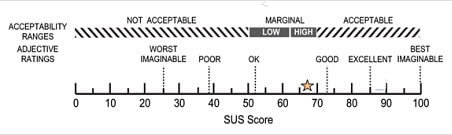
The System Usability Scale score.
Side note: Aaron Bangor, James Miller and Philip Kortum wrote an interesting piece about what individual SUS scores mean.
Diving deeper into the result
Though the score will be between 0 to 100, these are not percentages and should only be considered in terms of their percentile ranking. Let me quickly explain why.
So according to research, a SUS score above 68 would be considered above average and anything below 68 is below average. You also have a different average score depending on the system you’re testing. For example, the average score for consumer software is 72. The SUS score, however, will stay the exactly same. As you might know, with percentages, the average would be 50, which is why the SUS score is not a percentage.
Conclusion
The System Usability Scale is a cost-effective, quick and easy way of understanding to what extend your users perceive your system’s usability. However, the SUS shouldn’t be the only instrument of measuring the user experience. Also, the SUS does not substitute (but is highly correlated) for measures of loyalty or satisfaction.
If you have used the System Usability Scale, please share your story.


Really interesting article Paul. This is the first I’ve heard of this scale and I’m keen to give it a go following usability tests
Thanks Caroline! Let us know how it went and what you think about the results! I’m really interested in other use cases.
SUS is simple yet effective method and as stated above is not a complete solution in itself. We liked the approach so much that with John Brooks’ permission developed an online tool which does analyses on the fly: https://www.usabilitest.com/system-usability-scale