Introduction to Mobile UX
Mobile has changed the way we interact with content. As UX practitioners, we need to rethink the design paradigm for the web. Simply translating desktop designs to mobile screens is not an option. Small touch screens on smartphones, tablets, and e-readers change the way users input and interact with content.
Established desktop behaviors (i.e. mouse inputs, physical keyboards) are removed from the mobile experience. We need to optimize the interaction, strip away redundancies and focus on the essential tasks that support user goals.
Traditional interaction elements are removed from the mobile experience, but users are now offered a new set of input methods that are not possible within the desktop environment. Mobile technology has provided us with touch screens for gestures of tap, flick and drag interaction; GPS for location-based services (geolocation and mapping); accelerometers to leverage tilt and screen orientations; and the camera(s).
Also remember not to treat tablets and smartphones in the same way when you build user experiences for mobile. Each device has its own set of interactions and context of usage and the UX for each device and platform needs to be considered unique.
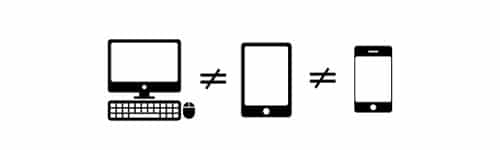
Desktop is not the same as tablet and mobile.
Human Interface Guidelines for mobile UX
When starting to design mobile user experiences, become familiar with the each platform’s Human Interface Guidelines (HIG). Each operating system/platform has its own HIG resource and will provide you with information on each OS’s unique design patterns and user interface caveats and best practices.
Resources:
Android Design
Apple Human Interface Guidelines
Blackberry 10 UI Guidelines
Going Analog
Mobile is a digital environment and we have a variety of tools and frameworks to choose from and work with when designing mobile content and the mobile user experience. Let us put aside the digital tools and get back to our designer roots. Drop the technologies and go analog. Pick up a pencil and sketchbook.
Sketch, Iterate, Repeat
Sketching is an essential part of UX design. It frees you from the confines of digital tools and offers a way for you to visualize your ideas quickly. Sketching allows you to see the possible movements through the information space. “If the user taps here, they will go there or get this.” A series of boxes and arrows will give form to your idea and illustrate your interaction. Everything is possible here. Don’t limit your ideas.
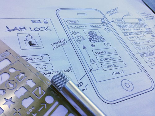
Work in progress of mobile sketching with the help of an iPhone Stencil Kit.
Iterate your ideas. One of the hardest things to learn in building mobile user experiences is to let go of your initial designs, sketches and ideas. Try a new approach, take a new direction or look at your sketches and think about what can be improved or removed. Most importantly, consider whether the current set of interactions is essential to the functionality and more importantly user experience. Simple is hard to do. The practice of iteration will help push your designs forward towards building a better user experience. Repeat the process; flesh out your designs; hone the user experience.
Ask Users
When you are finished with your first set of mobile UX designs, search out users for their input and criticism. You may not receive the type of feedback you were hoping to hear, but honest feedback is the most valuable feedback. Celebrate positive feedback, but more importantly act on negative feedback from your users. Go back to sketching and iterating your UX designs.
Asking users will help you further understand how users think, how they will interact with the mobile application and identify friction points and flaws within your mobile UX designs. Empathize with the user to keep your mobile designs user-centric.
Pivot, Snack, Burst & Plan for Interruption
Mobile users often access content by snacking – pivoting through information in quick bursts. These information snacks occur when the user is waiting in line or requires a piece of information quickly. The user’s attention is only partially captivated by the mobile app and is distracted by the world around them.
Ultimately, mobile tasks are interrupted. How you will help the user restart their interrupted tasks? Keep tasks simple and short. Tasks with heavier cognitive loading or too many steps should be broken into smaller tasks and into short micro interactions.
Always Remember
Mobile is tactile and unique. It is not just a smaller version of the desktop experience. Users may never be 100% engaged in your content. Treat your mobile UX as a continual work in progress.

What you should read next


Yes, you are right today people are using more mobile device than desktop Hence just design for desktop is not a best option, we have to design for mobile devices also. Thanks for sharing such a nice information about mobile UX.