Designing Onboarding Screens – How to Face a Challenge
According to the dictionary, the word “onboarding” originally comes from the phrase “to get someone on board” which means to get an approval or support from somebody. Further down the definition, it takes on a different meaning as part of the HR functional lexis. In the terminology, it implies training and adaptation of new employees.
Now, the term is widely spread throughout the IT industry, especially in the area of mobile development. Here, its meaning hasn’t changed much. It still stands for education and orientation. Yet, the target audience is replaced with the users of a mobile app. The onboarding screens are designed to briefly show them how the application works and what main functions it has.
In this article, we are going to learn how to create “correct” onboarding screens and how to avoid the most common mistakes.
When do you need Onboarding Screens
Onboarding screens represent a brief summary of your application. If you are not sure whether you need them at all, try to answer the questions below. Each negative response will alert about the necessity of their development.
Is your app controlled by familiar gestures only?
Everybody knows how to scroll, tap, and zoom. However, some gestures are not that known. For example, there is a minor part of users who swipe to the left in order to delete the elements of the list. If you build the interaction with your app on the gestures like this, mind providing your customers with the relevant instructions. Also, it would be reasonable to give them an alternative choice. For instance, you might add the Delete button which could be hidden, for example, in the Actions menu.
Do you design identically for each platform?
We all know that transferring app design from one platform to another without any changes is unacceptable, don’t we? Moreover, if your users are accustomed to working with the web version, and you release a mobile application, the design concept may differ radically. In this situation, you need to take care both of existing and new users. The first ones should find the main functionality and a similar design in your app, and the latter – learn your product in an easy manner.
Does your app include cut and dried functionality?
There is no need to explain how to work with calculator or app notes. But in case your app offers highly specialised functionality, you should guide the users through it. Let’s take a financial application for accountants. Of course, you don’t have to go into details about what is a chart of accounts or balance sheet. Each accountant knows the purpose of these documents. However, not every specialist understands how to download, create, or systematise these papers in your program.
How to compose Onboarding Screens
Once you realized that onboarding screens are the must-have, you might take another challenge and think which way to approach the implementation process. Fortunately, you don’t have to reinvent the wheel. The best practices of design offer three basic techniques, namely:
1. Benefits-oriented onboarding
With this approach, you do not give instructions on how to work with your application but communicate which way a user is going to benefit from it. Here, you are supposed to describe what exactly your app does, how it does, and when it can become irreplaceable in users’ life.
When to use
Such technique is generally applied with a purpose to motivate people to start using your app. Given that the app stores are packed out with all kinds of applications, no one would waste the time with useless things. People need some sort of guaranty that the product will come in handy.
Here is how Airbnb introduces itself to the future clients:
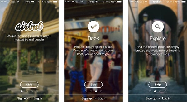
Benefits-oriented onboarding screens by Airbnb
2. Function-oriented onboarding
As contrasted to the previous approach, function-oriented onboarding does not intend to praise your app. It aims to point out the main features and show how they work. You can think of it as a short and greatly simplified user guide.
When to use
Complex app with non-trivial functionality requires such way of onboarding. You gain more trust from potential customers when showing them that your app is not that difficult to use. A clear and simple description will encourage them to further interaction with your creation.
Here is how Clear app explains to users how to interact with its interface:
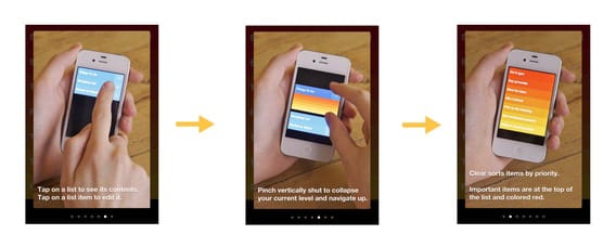
Function-oriented onboarding screens by Clear app.
3. Progressive onboarding
Such solution gains popularity in these latter days. Note that it takes place during the app running but not before it’s installed. With progressive onboarding, you show the necessary hints just in time when a user needs them. For example, when the user opens the home screen, he / she sees the information about how to work with this screen and where to find appropriate settings.
When to use
It is suitable for apps with long and complicated workflows. You do not overload the user with all the information at once but break it to pieces. Proper instructions and tips are given as the app is being explored.
Progressive onboarding is also needed if your application has hidden options. Without step by step guiding, the users may not ever discover them at all!
Here is how Flipboard Pics guides its users through the app:
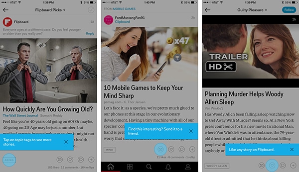
Progressive onboarding screens by Flipboard Pics.
Few tips for effective onboarding
Each application is unique. In view of this, the best recommendation as for effective onboarding is to use creativity and imagination. Still, there are few rules that would be helpful no matter what technique you choose.
Structure the data by priority
Display only main functions or the most important benefits the user is going to have with your app. Don’t go into the smallest details.
Place not more than one concept per slide
It will help users easily absorb the information and not to get lost in the unfamiliar schemes.
Use plain language
Compound sentences, unclear terms, and twisted expressions are not what you need when making onboarding. Try to convey the idea in a simple language.
Take the users as intelligent beings
Despite all the above, don’t explain the obvious things. Everybody knows that the cross sign means close or exit, and the tick – accept or confirm.
Summing up
Onboarding is a great way to introduce your app to the customers and show how it works. Whether they are newcomers or experienced users, properly structured information provided in an understandable form would serve them well. The main principles in onboarding design are simplicity and minimalism. There is no need to get involved in the maze describing the benefits of your app. Also, you don’t have to explain the straightforward things.
I hope this article has shed some light on the topic. If you have any extra information, feel free to leave a comment. For more inspiring posts from the world of mobile development, subscribe to our newsletter!


Good article! Keep wrtiting :)