3 Surprises from Combining Qualitative and Quantitative Research
It is (hopefully) common knowledge amongst UX practitioners that it is beneficial to test early and test often. However, how to test and what to test may not be as well-known. Qualitative research allows the researcher to dig deep into the causes and consequences of behavior. Quantitative research allows the researcher to project how many or most users will behave.
Qualitative vs. quantitative research
Neither gives a whole picture and designing with only one or the other has inherent risks. Here we’ll examine the benefits of these tests and see some interesting surprises that could only be uncovered with the combination.
Testing the quality of user experience of a website, app, or software typically involves qualitative usability testing with a small group of users. Usability testing reveals errors and can identify what can go “wrong” with an experience. A limitation is that it does not generate enough data to accurately predict what will go right.
Quantitative testing requires a statistically significant amount of participants. The exact number varies based on the test objectives and methodology, but the number is usually in the hundreds, unlike qualitative testing. It can tell you with confidence how many users will take a certain action. A limitation is that it does not generate data on motivations behind those actions or perceived satisfaction or dissatisfaction with the outcome of those actions.
It is difficult to design to elicit a specific outcome when you don’t know why people do something. For example, quantitative testing such as traffic log analysis can tell you people spend a certain amount of time on your site. But it won’t tell you if they’re spending a lot of time because they’re engaged or because they’re lost.
On the other hand, not knowing how many people behave a certain way makes it hard to prioritize a feature. For example, you may observe some users clicking on a link with a certain appearance. But not knowing how many users will click on that type of link presents some risks when your business goals depend on users clicking on that link.
Now let’s look at those surprising user behaviors observed through the combination of qualitative and quantitative testing.
1) The Myth of the Fold
“Put it above the fold”. While I’ve never heard a user say that, it’s come up dozens of times from clients. If you’re not familiar with the term, the “fold” originally refers to content appearing on the top of a newspaper page (with the remaining content in the half of the paper that is folded under). In website terms “the fold” is used to describe content that can be seen on the first load of a page, before the user scrolls.
In qualitative usability testing I observed a strange, but logical behavior. Users would click on a link, wait for a page to load, and immediately begin scrolling to maximize the amount of screen that would contain valuable content. They would scroll just enough so the page header (any title, graphics, ads, main navigation) would be out of view and as much content below would be visible. They’d then stop, read, and if they continued past what was visible they’d scroll some more.
Observing this in qualitative research was interesting but wasn’t necessarily actionable until I saw it quantitatively. Using a tool called SessionCam it is possible to gather data on thousands of users and see what parts of a webpage are in view for the longest period of time. Using this quantitative research it was observable that enough site visitors performed the “header edit” scroll to demonstrate a significant pattern.
With this in mind, it has redefined the concept of the location of “above the fold.” It’s actually a screen-height below the header of the page. This means that important information/ links/functionality are often hidden if they are placed at the very top of a web page. This is totally counter to logic and perception. Seeing this qualitatively brings up questions and possibilities of designing to accommodate it, but it’s not until it’s quantitatively observed that I’d be comfortable making design decisions that depend on this behavior.
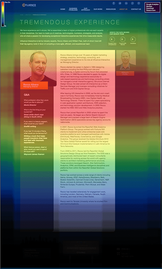
This example shows a heatmap of what parts of the screen are exposed to the user. Blue is little exposure, red is most exposure. Note that the top of the screen, which is visible by default, is dark blue, meaning that the users who have visited this page do not see that part of the page for very long at all. Also note the red area, this is what is in viewed most often. This area includes screen that users must scroll to see.
Note – there are many tools that will give you this information as well as other quantitative user behaviors. Paul Olyslager has a review of these tools on this site.
2) Prominent links
Several times in my career I’ve found that the entire focus of a user experience strategy and the measure of success of an experience comes down to users clicking on a single link. Clicks on call-to-action links are one of the highest priorities of a site design, and one of the most empirically measurable ways to evaluate if an experience is performing as well as it needs to. It is logical to assume that adding typical design qualities to increase prominence like bright colors, photos, or increased size will make a link more noticeable, and therefore more clickable.
In addition, quantitative research was provided to me by an accident. Working at Razorfish at the time, I had access to their Advanced Optimization tool. Advanced Optimization was a tool that tracked user events including clicks and scrolling. It was able to track exactly which link was used on a page.
There are other similar tools now like the ones mentioned above. On two separate sites the interface designs happened to provide users with both stylized graphic options and simple, underlined text links to the same destinations. I was able to see the results, and across thousands of users the text links outperformed graphic links by 15 to 1. In one example the outperforming link was “below the fold”.
3) Scrolling
The last example of qualitative and quantitative research combining for a unique insight is a great demonstration of why both types of research are truly important. Users scroll. They don’t all scroll all the time but they do scroll. This comes up often as requests to put information above the fold.
Tools like the ones mentioned above or Google Analytics will help you learn how many users scroll on your site, and how far they scroll. It’s a safe bet that you’ll find about a 10% drop-off per each screen height. So if your page is about 10 average screens high, you’ll get only about 10% of users getting to the bottom. Or 90% of users will see the next screen height’s worth of page “below the fold”.
There is an exception to this, however. If the design is such that it looks like the page is complete and no scrolling is necessary. If an object, especially text overlaps so that it is cut off at the bottom of the screen, it will create a visual cue telling users that there’s more to see. If this is the case users will often scroll. If it is not the case, users will rarely scroll. This is not something that could have been learned in purely quantitative research. It’s only through direct observation that this would become clear.
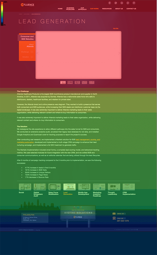
Here the heatmap shows you scrolling activity on this page where the design looks complete in the first view and doesn’t have a visual cue to continue. You can see a clearly where the red stops and below that there is a sharp drop in users who scroll.
Here the heatmap shows that users are scrolling on this page, and the design that does not look complete on first view is providing a visual cue to continue. These pages are from the same website, but the design is prompting different behavior.
Conclusion
An informed design is a more effective design. A combination of both qualitative and quantitative research will provide data on behavior and motivations for that behavior, allowing UX practitioners to make confident decisions when designing an interactive experience.


This article really good and worth reading, but I have a question regarding your blog’s design. How will I come to know the article, I am reading is new or older? I mean there is no date of the post in your blog.
Hi Gopal,
thank you for your comment. I do not mention the publication date of my articles. I performed an A/B test a while ago and the test result showed a lower bounce rate when the publication date was invisible. I realize the consequences but I’m on the verge of rethinking this.
Happy to hear that you liked the article!