The Optimal Text Layout is More Than Line Length
I’ve read a lot of articles with endless bullet points on how to improve a website’s usability. Unfortunately I rarely come across a post bringing up text layout or typography (heck, I even forgot about it in my previous posts). However, when it does, it seems to be limited to the optimal line length.
Is readability, and therefore text layout, condemned to merely an amount of characters or words on a line of text?
If content truly is king, all aspects of text layout (and not just line length) should be treated with the utmost respect.
In this article I summarize several interesting study results in the field of text layout. I have used Mary C. Dyson’s paper, called “How physical text layout affects reading from screen”, as a guideline.
Studies
It’s true, text layout hasn’t been the subject of many studies to date. This is in contrast with the amount of research done on line length. Other variables, such as columns, window size, interlinear spacing, interaction between characters per line and eye movement, scrolling movements, reading patterns and format familiarity are equally important.
Typographic variables have been studied abundantly throughout the years. Think about typefaces (e.g. Serif or Sans Serif Typefaces), indented paragraphs, character density, letter spacing, type size (because of its relation to line length) and many others.
Some variables in-depth
Line length
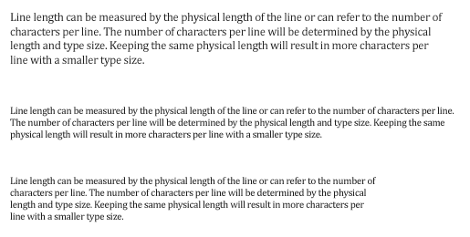
Line length can be measured by the physical length of the line (e.g. by adjusting margins). It can also refer to the number of characters in a line. The number of characters per line can be varied by changing type size, but keeping the same physical length, e.g. 15 centimeters.

The relationship between physical line length, number of characters per line and type size.
Reading takes place in small leaps of 5–10 characters at a time. 55–60 characters (including spaces) per line could be considered an appropriate line length. This allows the eye 6 to 12 quick stops on each line. Narrower lines would cause the reader to have to switch from line to line unnecessarily often. They also cause problems with the way justified columns appear.
Type size
Lucian Bernhard compared 10, 12 and 14 point sizes of eight type faces and measured the ‘reading efficiency’ (reading time / accuracy). The study found 10 point font size were read more slowly than the 12 point size. There was, however, a trade off. Fonts that were read faster were generally read less accurately.
In a more recent study by UX experts Martin Pielot, Luz Rello and Mari-Carmen Marcos, the conclusion was that an 18 point font size provides web readers with the best readability and comprehension for body copy.
Characters per line
Using more recent display technology, Dyson and Kipping (1998) looked at line length by keeping type size constant and varying the number of characters per line. The results showed that the number of characters per line affects reading rate with the longest line read faster than the shortest line tested.
The readers’ perceptions of ease of reading however was contradictory to the results. A medium line length of 55 characters per line was rated as easiest to read, but was not read the fastest.
A possible reason could be that if the lines are too short, readers cannot make use of much information in each fixation. If line lengths are too long, the return sweeps to the beginning of the next line are difficult.
Letter spacing
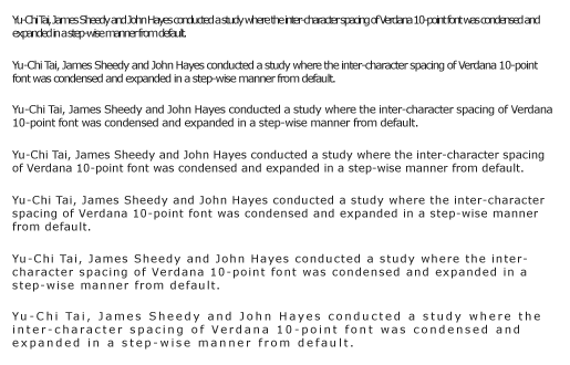
Yu-Chi Tai, James Sheedy and John Hayes conducted a study where the inter-character spacing of Verdana 10-point font was condensed and expanded in a step-wise manner from default.
The researchers found out that word legibility significantly improved as letter spacing increased, but never exceeded single letter legibility. Read the study Effect of letter spacing on legibility, eye movements and reading speed.
Interlinear spacing
Bouma described the optimal interlinear spacing (also know as line height or leading) first back in 1980 as “The angle of the return sweep should not be too small”. A bit too vague in my opinion.
One year later, Kolers looked at interlinear spacing as well. He compared single and double spacing in addition to character density. He found out that single spacing required a few more fixations per line. On top of that, there were slightly fewer words read per fixation and the total reading time was slightly longer. They concluded that double spacing is marginally superior to single spacing.
A lot has changed since the ’80. Later in this article you will find that the optimal line height actually depends on other variables.
Well-designed and poorly-designed (text layout)
Early studies by Duin compared two versions of screen designs, a well-designed and a poorly designed screen (uncluttered vs. cluttered screen) and showed it to his students. In comparison to the poorly-designed version, the well-designed version appeared to help students as they asked fewer questions. They also worked through the task with greater ease, were less anxious and showed greater flexibility.
Text layout isn’t only about the efficiency of reading but also affects the learning process.
Conclusion
The optimal text layout is difficult to define due to the relationship between its variables. For example, long line lengths are said to need more interlinear spacing to ensure that the eyes locate the next line down accurately when executing a return sweep towards the end of the line.
A proposed solution by Lund in 1999 is to adjust all these variables in order to maintain a constant relationship or ratio between them. If you change line length for example, you should make a corresponding increase in interlinear spacing. The rule of thumb is that long lines (wide columns) require bigger line spacing than short ones.
I have cited some older studies in this article, which were to my regret, poorly constructed with many “confounding” factors that the researchers did not anticipate. Therefore, categorical declarations about the optimal text layout are hard to back up with evidence.
There are, however, some guidelines to help you out:
- 12 point size font as an absolute minimum,
- don’t condense letter spacing,
- when changing line length, change the leading accordingly,
- Remember: optimal is not necessarily fastest reading line length but is the size preferred by the users,
- think about the impact on line length and leading when changing font size,
- keep the text layout clean and uncluttered and use enough white space.
You could also try a more mathematical approach to determine your optimal text layout.
Conduct your own study with Google Analytics
As you might know, Web pages are frequently skimmed rather than read in detail. There are also circumstances in which we read at a normal rate. So how can you improve text layout and/or wording if you don’t know if, when and how people actually read the content? In other words, what is your visitors’ engagement with your articles?
In a very interesting article titled “Advanced Content Tracking with Google Analytics“, author Justin Cutroni explains how to track the following metrics:
- How many people scroll
- When a person starts to scroll
- When a person reaches the end of an article (not the end of the page, but the end of the article or post area)
- When a person reaches the bottom of the page (the bottom of the HTML)
- Which website visitors are scanning my articles and which are reading my articles
Think about the value here! We will be able to get an accurate measure of which articles are actually read and differentiate the skimmers from the readers. We can even see which articles are so engaging that visitors continue through the comments to the bottom of the page. Very useful stuff.
And in the end I have used a bullet point list in this article after all.


Text plays a HUGE role in user satisfaction.
I recently sat down to focus only upon the text (font, color, size) of my blog.
I used to use Arial and some google webfont. The size was small and the color was light gray.
I noticed that I didn’t use to enjoy reading my own blog, due to the text.
So I increased the size, changed the font to Georgia (which is my favorite for text body) and made the color dark.
I also played around with line height to make text more readable.
It worked like a charm!
Thank you for your comment Pritesh Desai. The colour palette of your website is pretty greyish, just like mine. Changing your font to a darker colour increases contrast and therefore readability. Good job!