Why Online Fonts Need to Be Bigger Than You Expect for Awesome UX
You’ve likely heard the old saying that “bigger is better.” When it comes to online fonts and reading, new research strongly suggests that this applies to the web in particular. This study is especially significant because it generally goes against the grain of what we’ve always been told regarding web readability in a big way.
You’d be forgiven for thinking that optimal online reading is to be found with smaller fonts…since that’s what a lot of authority sites had been saying up to this point. But whenever we come across new, groundbreaking, UX research, we have to calmly examine it to see if it has any merit. This new study has a lot!
The Study Says, “Make Fonts Big!”
In a new research paper from earlier this year, UX experts Martin Pielot, of Telefonica Research, Luz Rello, of Carnegie Mellon University, and Mari-Carmen Marcos, of Universitat Pompeu Fabra, concluded that 18-point font size provides web readers with the best readability and comprehension for body copy.
This study, titled “Make It Big! The Effect of Font Size and Line Spacing on Online Readability,” wasn’t just groundbreaking because it challenged conventional wisdom, but also since it focused on examining the general population and how it reads on the Internet.
Methodology: The researchers studied 104 participants who had to read text on Wikipedia while using a 17-inch monitor with integrated eye-tracker. They used Firefox browsers displaying font in the default of sans-serif Arial. Six font sizes—10, 12, 14, 18, 22 and 26—and four line spacings (0.8, 1.0, 1.4 and 1.8) were compared.

Image from Wikipedia
A quick word on font size and line spacing. Regarding the former, points and pixels are sometimes confused; point are independent of resolution, so 16 pixels is normally about 12 points. Regarding the latter, line spacing is the vertical distance between the baselines of two text lines.
The Shocking Results That Defied the Old Recommendations
The study authors boldly recommend that, for best web readability and comprehension, all websites should use, for body copy, 18-point font size and 1.0 line spacing, which is default. On either Firefox or Chrome, you can get 18 points when you set your browser to 24 pixels.
They concluded that readability and comprehension significantly improved when font sizes were increased to 18 or 22 points, way more than the standard recommendations of 10, 12 and 14 points. However, beyond 22 points, they discovered no additional improvements in readability and comprehension.
“Researchers concluded that readability and comprehension significantly improved when font sizes were increased to 18 or 22 points.”
When it came to line spacing, they determined that it only had a small impact on comprehension. They believe that making line spacing, therefore, too small or too large can be detrimental to online comprehension.
Authority sites like Smashing Magazine have studied optimal font sizes in the past and recommended 13 pixels (approximately 10-point) for body copy back in 2009; they looked at the question again in 2013 and that time reported that 14 and 16 pixels (about 10.5- and 12-point) were most popular. In 2011, Smashing Magazine flat out stated that you needed to make your body copy 16 pixels.
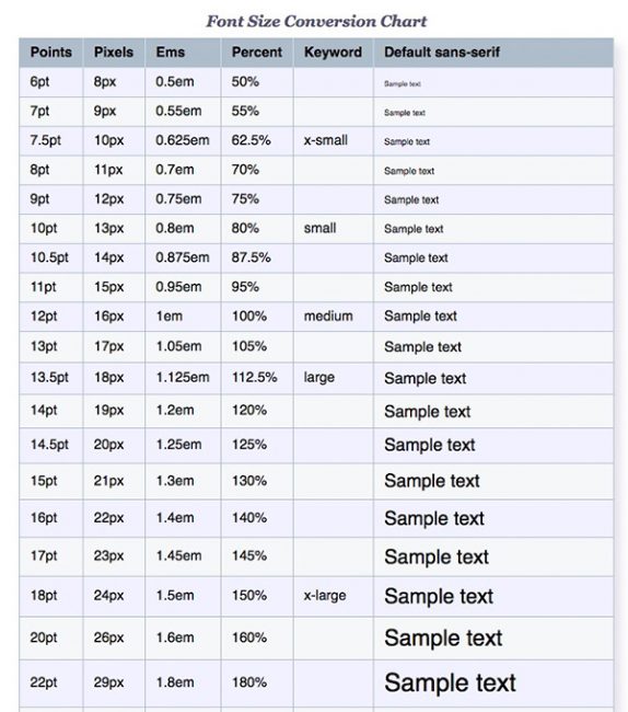
Image From webSemantics: Online Fonts
However, with this new 2016 study, recommendations of past years have to yield to the freshest research results.
How This All Ties Into Excellent UX
The trend is clearly toward sites using larger and larger font sizes in the body copy, with this new recommendation of 18 points. Even in the old Smashing Magazine articles, you could see the trend was to increase pixel sizes, as 13-pixel recommendations from 2009 turned into 14- and 16-pixel recommendations four years later.
The results of “Make It Big!” have implications for conversions, sales and the bounce rate, too.
When visitors can see something better due to bigger font sizes—like a call to action button or sales copy screaming urgency and scarcity—they can respond more appropriately. A “buy now” button with bigger copy is going to get clicked on more than one with smaller copy that’s harder to read. A paragraph of text advertising a last-minute sale that’s going to end soon will also be more effective if visitors can read it more easily thanks to larger font. They’ll be able to comprehend it better and act on it.
It stands to reason that bounce rates get lowered, too, when body copy is more readable due to larger font sizes. After all, when you can easily read a site’s content, you can interact with it more efficiently—and that typically leads to people spending more time on said site.
So to design a great site with a phenomenal UX that produces happy readers who can easily understand the info on your site, go with a font size of at least 18 points from now on.
Editorial note: The performed research was done with desktop screens. Since more and more reading is taking place on tablets and mobile phones with much smaller screens, additional studies are required to verify the above findings for those devices.

What you should read next


No responses yet to “Why Online Fonts Need to Be Bigger Than You Expect for Awesome UX”