Call to Action Buttons Part 4: Message
I wrote quite a lot about Call to Action buttons already but I was still missing one key element. In this chapter, which could be the last one in our series about CTA’s, I explain what kind of copy (message) in call to action buttons will trigger your readers into action.
Don’t forget to check out the other parts at the bottom of this article.
Choosing the right words for your call to action buttons
Usually, people “tune out” the conversations and noises around them if they are in a crowded room. Nevertheless, if someone calls out your name they will probably attract your attention. The same goes for the message in call to action buttons. Choosing the right words or psychological triggers is highly determined by the level of emotional identification that word prompts. No emotional connection means no action.
And how do we do that?
According to some studies, such as “Paradox of the Active User” by John M. Carroll and Mary Beth Rosson in 1987, most people avoid reading whenever possible. A study in 2007 by the National Endowment for the Arts confirmed the results of 1987. So how do we get someone’s attention when they’re not reading any copy?
It’s all about finding the correct emotional triggers for your readers.
Say something meaningful
The word(s) should describe the action or result of the CTA. Since people don’t read, naming a button with ‘OK’ or ‘Cancel’ doesn’t help them in any way. Don’t force people into reading the entire dialog to understand the meaning of the button. Choose your message carefully.
Also, try to avoid the ‘Click here’ and ‘Submit’ messages. I recently started a discussion about this at StackExchange titled: “Why shouldn’t we use the word ‘here’ in a textlink“.
Use verbs to encourage action
It’s very simple: when you don’t include a verb into the copy, readers are not encouraged to take action. Strong action verbs have a big impact on the strength of the copy and will draw attention. Some examples of strong verbs are Buy, Shop, Watch, Compare, Download, Test drive, … Some examples of weak verbs are Click, Get, Try, See, Read, …
Use verbs in an active tense instead of a passive tense
There is a big difference between “I throw the ball” (active) and “The ball is thrown by me” (passive). The active version is much stronger, creates an interest and emphasizes the action.
Use words people understand
Maybe you sound more professional when you put technical buzzwords into your copy but when users don’t understand the message, they don’t use your product.
Create urgency or scarcity
As David Barker already explained in his article “The Persuasive Web and the Effect on UX” you could tempt people by:
- creating an urgency (Offer expires in 2 days). Such limitations implore unconsciously that they must take action now, even though you’re not directly pushing them to act.
- creating scarcity (Only 3 products left). It’s the law of supply and demand. The less the supply is, the greater the demand will be.
Whenever you apply urgency or scarcity into the copy, you must include numbers. Instead of saying “Only a few products left”, which is pretty vague, you should say “Only 7 products left”. This is a great way to demonstrate that your message is clear and straightforward. People seem to trust numbers.
Integrate a subtext into the button
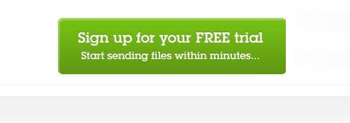
Not everything can be said in 3 words or less. Maybe it’s necessary to add extra information to the button, making sure people understand the consequences of the click. Fileshare HQ shows what is to be expected once the button is clicked.
Another great use of subtext is to convince people of your product by showing its advantages. Why not mentioning the fact that money transfers can be done safely with VISA or Paypal? To know the right trigger words you need to know what is holding your visitors back from clicking that button.
The use of images or icons
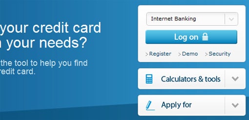
You could add a small icon to aid the message of the button. For example, by putting an affordance arrow behind or in front of the copy will emphasise the action. People realize that the button will take them somewhere and most probably leave the current page.
Another example is to show an icon that describes the action or gives additional information.
What about CTA’s in e-mails?
Don’t use images as a call to action in e-mails. Most people have their images disabled because it’s the default setting in many e-mail clients. CTA’s won’t render and your subscribers are completely clueless about what to do. There is a workaround however.
Give your table a background color (red) and a background image without text. The textlink must be placed on top of everything. When people have the images disabled, they will still see the textlink on top of the red background color. If they have images enabled, they will see the textlink on top of your image.

Your Call to Action buttons will be visible even when images are disabled in the mailclient by following these steps.
Other articles in this series
The perfect call to action button is not just about its message, which is why I have written a complete series on CTA’s.
- Call To Action Buttons and the Psychology of Color
- Call to Action Buttons Part 2: Placement
- Call to Action Buttons Part 3: Shape and Size
- Call to Action Buttons Part 4: Message






Paul I love all your call-to-action articles. I’ve been doing quite a bit of reading recently on active and passive writing. I think your passive example of ‘The ball is thrown by me’ might actually be active and have the same meaning as ‘I throw the ball’. Something like ‘I threw the ball’ or ‘The ball was thrown by me’ would be passive. I’ve been trying to write more in the active and it’s incredibly difficult to go against all those years of how we’re taught to write at school.
If you have any more examples of active and passive writing I’d be interested to check them out. Or maybe that’s an idea for your next blog post ;)
@Lisa Thanks for your comment and kind words. English is not my native language, so I may have made a mistake with the active – passive form. I got this piece of information from http://www.englishpage.com where they explain the difference between active and passive verb forms. Maybe I should look into it once more :-)
Hi – the click here thing – what you say is true for textual hyperlinks, especially in body copy. When we’re talking about calls to action – the use of click here is absolutely fine.
I have very solid data now from 35 countries where we’ve tested two part messages – a strapline which is right next to a call to action. So – you get “yada yada yada” [call to action] – ok?
So we’ve tested all those straplines out and learned interesting things. We also spent a lot of time testing wordings of the call to action button as part of the ‘two part’ message.
And guess what – Click here is either the top converting button wording, or it is in the top 3 results for that country – in any language. Cliquez ici, Click Here, Klik Hier etc.
So – this is just a UX myth. Click here works fine in the right circumstances and is actually one of our best wordings for calls to action. The other two are ‘Fix My Glass’ and ‘Get Started’ – these 3 are usually the top 3 versions but the order varies.
So – don’t get taken in by the click here myth – and always test out variants of your call to action button wordings.
Hi Craig. Thanks for the comment! It is true that we need to keep CTA’s and normal text links separate, thanks for pointing that one out and letting us know the results of your tests. It’s interesting to see that the “Click here” message scored very good in all languages.
If you ever want to share more interesting results, please let me know :-) .