Understanding Affordance in Digital Interfaces
Affordance is a word that sneaks into a conversation every now and then when talking about designs. But what does it actually mean? Affordance has had many definitions in the past. Its current definition is exhibiting the possibility of some action where it is not a property of either the object or person using it.
A perfect example to demonstrate this definition is a teacup’s handle, which provides an affordance of holding it with one’s hand. Again, it’s the possibility of holding the teacup. You must understand that affordance is the relationship between a person and an object, not a property.

A teacup’s handle provides an affordance of holding it with one’s hand.
In the past the definition has been a little different. The original definition of affordance described all possible physical actions one could do with an object. The term evolved into a bit broader sense where affordance meant all possible and obviously aware actions.
Currently the definition of the term is extended to include the discoverability of possible actions when it comes to digital interfaces. They key word there was discoverability because it’s not obvious what actions can be taken with digital interfaces; it’s all about discovering what is possible with digital interfaces since they do not provide as many physical hues as physical objects do.
Three types of affordances
Physical objects can be classified into three different affordance types: false, hidden and perceptible. A false affordance happens when there is in fact affordance but there is no function to it. A common example of this is pressing a button that doesn’t do anything. The functionality is still there – you can press the button as much as you want – but there is no reaction.
A hidden affordance means that there are hidden functions of an object – functions that are not obvious. Wikipedia provided a great example of this, which is that by simply looking at a shoe you wouldn’t be able to tell if it could also open a wine bottle.
Lastly, perceptible affordance is the affordance described earlier where a person interprets available information and then can act upon the affordance to interact with the object. For example, if you see a door with a vertical handle, you know that, just by looking at the object, you have to pull the door towards you to open it.
“… when affordances are perceptible, they offer a direct link between perception and action, and, when affordances are hidden or false, they can lead to mistakes and misunderstandings.”
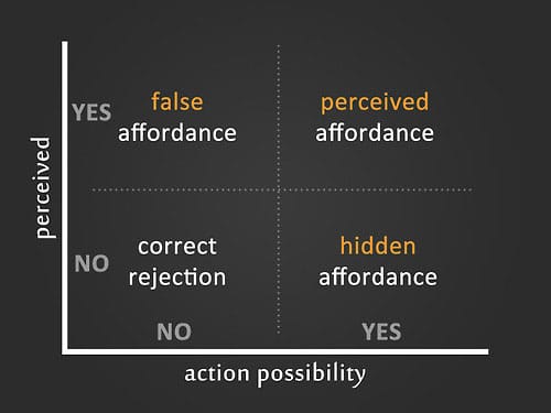
Three types of affordances.
Digital interfaces are special
Like I mentioned earlier, digital interfaces have a disadvantage to the physical world because interfaces lack dimensions. All you see is an interface on a flat surface – a screen. One could argue that technically a digital interface is not intuitive because of the lack of clues to show how things work. However, that doesn’t stop designers from creating great designs.
Skeuomorphism wasn’t always infamous
Way back in time, digital elements were made to look like real world counterparts on purpose. Think back to how buttons used to look in apps or websites before flat design. They were designed to resemble a real button with a bit of shadow and beveled top.
Although skeuomorphism is now infamous, its design roots made total sense. Before digital interfaces were so common and the now obvious design conventions were set having the digital designs resemble real objects made sense. Skeuomorphism wasn’t a stupid concept but design has evolved to something new. You could even say that the current design trends are more appropriate for the current technology.
But one thing is for certain; skeuomorphism is not something to be dismissed as a silly design phase. It was so much more than that; it was an attempt to bring physical properties into the digital world through visuals in order to help users use technology.
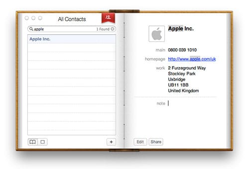
Apple’s book of contacts.
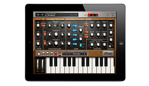
A synthesizer app for the iPad.
Digital is so complex
Here is one last example; actually a great example of affordance in the digital world is showing people when their smartphones or tablets are being charged. By simply looking at a device that’s plugged into a wall you can assume – or hope – it is being charged. There could be a physical light that blinks to indicate charging; we’ve accepted this type of behavior – the flashing light – which means charging.
However, it’s not always as simple. In order to let users know an iPhone is being charged the battery is displayed on the screen including a message ‘Battery Charging’. This is done because some things cannot be cleverly solved in a digital interface no matter how much you try to make it look like a real life object.
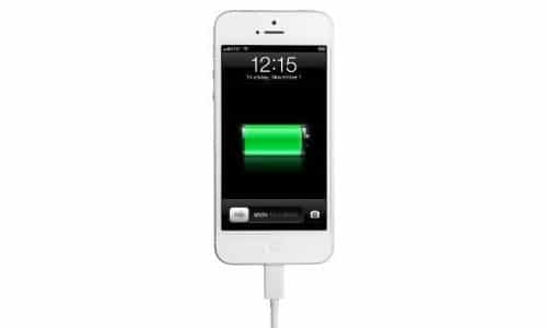
Charging your iPhone’s battery.
To conclude or …
So far I’ve been only able to touch upon the basics of affordance and how it affects the digital world. My main goal for this article is to make sure you understand what in fact affordance is and how there is a great challenge for designers to ensure it’s within their digital designs. I’d like to think I’ve achieved that. But, like I said, I’ve only scratched the surface.
If you are looking to learn more about this I urge you to read The Design of Everyday Things. It’s super insightful and filled with great examples to help you figure out how to go about affordance as a designer.


There is a message I got here which I’m not sure comes through clearly in the article. Affordance in digital is cultural (and in the physical world too). Take, for example, the humble hyperlink, when I see blue underlined text I perceive an affordance that I can click on this to go somewhere else. My wife on the other hand often complains that she cannot find something until I show her that she click on the blue underlined text. I’ve lived in the hypertext World that consisted of only text and links, when she started using computers regularly the web was already graphical.
I’d also like to challenge the thinking embodied in the phrase “although Skeuomorphism is now infamous”. This is something that we should be gravely concerned about. The design industry has a tendency to treat these things like trends. This is not some tool that can be cool one day and not the next. It’s arrogant to think that we no longer need the idea of skeuomorphism because everyone somehow knows how a digital interface works. Excuse the language but that’s bullsh!t. Maybe this is why the market for tablets is dropping out, we’ve reached saturation because the only people that have any idea how they work are under 30.
Great article. All the debate about skeuomorphism, flat design, etc. should really all be about affordances. Here’s my take on it:
http://quotableusability.blogspot.com/2015/08/affordances-are-baby-to-skeuomorphisms.html