The Theory and Practice of Sketching within the UX Industry
Sketching is inherent within our industry; be that as a UX designer or a UX developer. It’s a medium in which to jot ideas, visually, either for your own reference or as an indication to others. I sketch everyday and use it to problem-solve issues.
It is the first step in a brainstorming exercise (with myself) to note ideas – be that on the back of a business card, post it or within my notepad. It’s also always the first thing I do collaboratively when undertaking a wireframe exercise. Giant whiteboards or flipcharts to visually represent ideas and solutions that the group discusses is much more appealing than continuous prose.
It’s certainly grown in its popularity within the UX industry, taking experience from designers, and so I wanted to explore this further. Why is sketching so important for a UX designer? Even if you’re not a designer, should you sketch? How do you sketch? Are some sketches better than others? What are the best tools for sketching?, and so on and so forth.
Let’s start with a definition
Sketches are not drawings; this is a common misconception. Sketches are the first in an iterated approach to reaching a solution. It’s visually problem-solving as the lowest common denominator. It’s a visual representation of an idea that constantly evolves and morphs into something slightly more refined at a later date (perhaps this is a drawing?).
Basically, perfection is far from the issue. They are not necessarily intended to communicate something to someone; they are an idea.
“My sketches often demonstrate an idea with scrawlings that no one will understand without me talking them through it (it doesn’t help that my handwriting is akin to that of a 5-year old either).”
That being said, whilst sketches don’t have to communicate to others, them being coherent enough that they can communicate to others, is a skill. The more you do, the better you’ll get. Also, each to their own – some sketch in different ways. The underlying approach being that a sketch, or sketches, will help form an idea more effectively and produce a better end result.
How did we get here? A brief (very brief) history
Good question. All sketching is essentially a rough composition of an idea, in this sense, a drawing or visual representation of a concept or thought. For example, we could date it back to Leonardo Da Vinci’s Vitruvian Man, which showed the sketch of a human body proportions with relevant annotations relating to the reasoning behind his theory. But in reality, we can date the theory of sketching back much before this time.
Ultimately, the proliferation of sketching is a natural evolution to be involved in strategy. If we take the notion of ‘strategic thinking’ and merge this with the concept of ‘design’, sketching, in some form or another, is bound to be an output. So when talking about business or management, sketching is a natural evolution.
Who should sketch?
Everyone. We are discussing a creative output and everyone is a designer. I’m sure that will be quite a contentious statement and I’m fully aware that in our industry not ‘everyone’ is a designer. I’m not a designer. But inherently, accordingly to Don Norman, everyone is – although he does admit “Everyday people are not very good designers“.
This is good as it promotes the theory of collaboration. When you’re with your stakeholders – be they users, directors, CEOs, CFOs, designers, or developers – sketching is something that everyone can participate in. Ultimately, too, everyone likes to think they’re a designer so such a creative expression can benefit your objective. I have previously found those who are afraid at sketching or claim they are “bad” at it are sometimes the best at it – solely focusing on the structure and challenge at hand.
How best to sketch (in my personal opinion)
Going off slightly on a tangent, when I was younger all I wanted to do was draw. Genuinely true, I was the pale kid sitting in on a nice hot day drawing my own characters. I took my inspiration from animation and that’s all I wanted to do growing up – be a Disney animator using the age-old technique of cell animation. Sad I know. And alas, my career path took some turns here and there. But for me, the core concepts of animation still exist in my day-to-day role as a UX consultant.
Drawing freehand is an art and I was always taught that it all starts with a circle. Take a look at the character design of Mickey Mouse. The first thing we do is sketch a circle in order to understand the proportion of what we’re trying to draw. This is our starting point. The purpose of this is to begin the structure of the character. For me this is a good sketch; begin with a structure and improve from there.
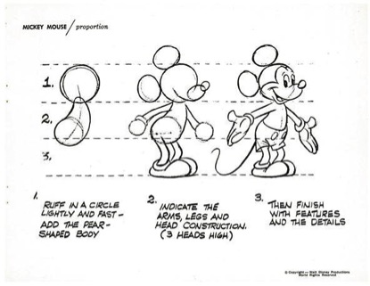
The proportions of Mickey Mouse.
To sketch your structure in UX design, we have various different options. I sometimes like to start by writing down the user challenge and relate to interfaces I’ve experienced before and how they overcome that user challenge. My structure, therefore, is based on annotations and rows that dictate content hierarchy, very similar to the Mickey Mouse drawing above. The top row being the head (or header for want of a better pun), the second row being the body (content) and the third being the foot(er).
The structure, however, could be a physical structure: perhaps in the way of a grid of a website. Here we could utilise the theory of the golden ratio. The golden ratio describes the relationship between two proportions; or 1:1.61 ratio to be exact. It’s believed to be upwards of 4,000 years old and used everywhere – nature, art, architecture and even web design. It’s therefore not uncommon to see a content area of 640px and a sidebar of 400px (1:1.6). So we can start with this if desired and this can be what our circle is to character design.
The difficulty with this approach can often be the argument of responsive design – by not drawing a grid we are developing a fluid, responsive sketch to a challenge. To get around this, you could use this responsive design sketchpad.
Alternative ways of sketching
An alternative route may be to sketch in layers which Peiter Buick discusses in “The messy art of UX sketching“. For me, this is a little down the line in the timeline of the concept of ‘sketching’. See the below, of which, ironically, I’ve sketched out.
Interestingly this does also bode the question of “when to sketch”. The answer, in my opinion, is “all the time, both consciously and subconsciously“. You’ll note that I am a strong believer in continuous improvement through conversion optimisation; that is the process of developing little and often to create and manage measurable results. My approach can be read here another time, but this requires more of a structured agile process to cultivate.
Within a singular website process however the theory of sketching comes within the ‘ideas’ phase that ultimately lead into either a design or a wireframe concept. You can see how the sketch in the diagram below becomes more and more refined.
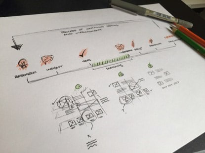
Sketching the process of sketching
If we’re utilising the theory of conversion optimisation, however, this process should be quick, iterative and cyclical. For something like this, sprints work best and the guys at Google Ventures have come up with a 5-day design sprint recipe that includes:
- Understand your users and their issues
- Rapidly develop solutions
- Select the best ideas and generate a user story
- Prototype quickly
- Validate, test and iterate
The 5 day-sprint isn’t too dissimilar from the above just packed in a shorter time frame. More importantly, they recommend a ‘paper first’ approach because “It’s faster”. Everyone can contribute (not just designers). Nobody gets too attached to the ideas that are generated because they’re so quick and rough. We purposefully use thick markers to make sure nothing gets too precious. Did I mention it’s faster? Great. This is just what we’re trying to convey – the theory of UX sketching is, overall, a better process for everyone because of these advantages.
Putting sketches into practice
Sketches are often so rough you might question how they can be put into a real-world example without sitting in a sketchbook as nothing more than “an idea”. The truth is that sketching can, should and is brought into the process of creating and improving websites; largely through idea generation.
Taking an example of one of Google Ventures product design sprints, they use a technique they’ve termed: “Crazy Eights”. Here, you must draw 8 sketches within 5 minutes. This is a “great way to crank out variations of ideas quickly” and they recommend getting everyone involved to draw the solution to an issue allowing for 40 seconds per solution. This is generally an adapted version of a studio/prototyping exercise in Todd Zaki Warfel’s book Prototyping: A Practitioner’s Guide. This is also an exercise advocated by Goodkickoffmeetings.com.
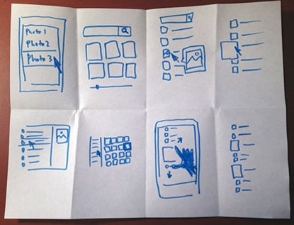
An example of Crazy Eights from the Google Ventures team.
Sketches put into practice are the difference between low-fidelity wireframes and high-fidelity wireframes. A low fidelity wireframe should always be advocated over a high-fidelity wireframe in my view, that is, rough representations of page layout and structure that help us to validate that structure early on in the design process. In effect, therefore, a low-fidelity wireframe is just a sketch of a high-fidelity wireframe. Whilst, yes, the high-fidelity probably communicates form and function better I believe they:
- Are slower at being produced when compared with a low fidelity wireframe
- Are easier to criticise. With a low-fidelity wireframe subjectivity will not come into the fold as much as it would over a higher-fidelity wireframe
- Lack focus. At the sketch stage we are communicating our thoughts with the client, explaining the rationale, focusing on that alone. I generally annotate my sketches but not the high-fidelity wireframes for example to give clarity and focus to the structure and content hierarchy alone.
Resources for sketching
Do you really need anything more than a pen and paper? Well, sometimes it’s preferred. There are plenty of resources out there available for sketching.
- Balsamiq is a form of sketching in that it’s a wire framing tool that reproduces the experience of sketching on a whiteboard, but using a computer. It allows the user to create wireframe mockups in a ‘sketch based format’.
- A good set of markers and a notepad are recommended in this article by Jason Robb.
- A printable set of templates by geekchix.org or a set of free responsive sketch sheets.
- Wacom do a set of tablets where you can take sketching to the next level by transferring all sketches online.
Conclusion
Sketching is imperative and nothing will replace the freehand. In the same way that newspapers, letters and phone calls will always exist all in spite of the internet, the freehand will too. It is a more natural, artistic form of communication and expression. Basically, it rocks. In our industry, specifically, sketching out ideas gives us numerous advantages and should not be ignored nor try to be replaced.
- Quick. Allows us to generate ideas rapidly.
- Collaborative. Gives us the opportunity to work with our stakeholders including both users and clients.
- Generates more than 1 valid solution
- Generate a deeper understanding of the problem you are trying to solve.


I received several interesting thoughts on this article through Linkedin, which I would like to share here as well:
From Piotr Kulaga, Analyst & Designer:
A great article Paul, except for the issue of software sketching. Their value, from a point of view of presentation, is only superficial at best. In terms of design process they are just as brittle and cumbersome as traditional wires.
Another significant point on freehand sketching (you may want to look into) is ambiguity. Both, in terms of representation of unresolved elements during design, and the potential for new interpretations as the sketch is being ‘read’ as part of a dialogue with other stakeholders.
There is a recent post with a link to a lecture by Bill Buxton, one of the best advocates of sketching in design http://www.linkedin.com/groupItem?view=&gid=112915&type=member&item=5964573875307032576 it explains the critical points I raised. An absolute must for anyone who keeps churning out products that fundamentally always turn out the same.
From Harri Suhonen, Creative User Experience Professional:
Nice article! For sketching user experiences, I’d recommend the following book as well: “Sketching User Experiences: The Workbook” by Saul Greenberg.
One other thought came from Daniel Engelberg Senior UX Designer, Strategist and Trainer:
Great to see a discussion of sketching. Sketching is often under-appreciated, but it’s critical to the success and creativity of a project.
It’s important to distinguish between two different purposes of sketching: supporting thinking and supporting communication.
In the initial stages, sketching is really just a way to augment thinking, by extending the working memory of the mind onto an external canvas. It allows the designer to externalize their thoughts and thereby have a dialogue with their thoughts. In this way it supports problem solving and creativity.
This is the stage that the author refers to as visual problem solving or representing an idea.
At this early stage, sketching serves a purely personal goal, like writing in a diary, and shouldn’t be confused with communication goals or with pleasing anyone else. Externally-focused goals cause self-censoring and steal concentration away from the primary goal of creativity and problem solving.
Eventually the sketched idea needs to be communicated to others, and at that point it can be refined or reworked if necessary for that purpose.
It gets more complicated when you sketch in a group, because here it becomes harder to separate the two goals of ideation and communication. The social pressures and immediacy of the needs can make some people censor their thoughts. Group sketching methods like Google’s “Crazy Eights” try to overcome this self-censoring effect by forcing people to sketch so quickly that they don’t have bandwidth to worry about what anyone else thinks. Or at least that’s the theory.
There are pros and cons to group sketching methods. As the author quotes from Google, they’re great for cranking out variations on a design idea. But in some ways they reflect a fundamental misunderstanding of how creativity works: the first ideas out are rarely the best, and great ideas often come from insights after long periods of reflection. But this isn’t a problem of group sketching in particular — it applies equally to verbal brainstorming. Despite these issues, group sketching can produce useful ideas that form a springboard for later insights.
Enjoyed the article!
One of my long-time challenges is to convince myself to keep the hand-sketching habit. It’s very hard when everyone is expecting wireframes from tools such as Axure.
I also keep dreaming of a magic tool to go from hand-sketches to tools such as Axure or Sketch. The answer seems to be forget, and just accept you must re-do your hand-sketch from scratch on the computer.
Thanks,
– joe