Web Design Trends for 2015
It has been a hectic few years for web design and development. The industry has been undergoing major shifts in the way website design is perceived by both designers and clients. The uptake of mobile devices, consumer demands and new innovations has led to an emergence of a lot of web design trends. These trends are currently reshaping the landscape of the design world.
While some of the web design trends have quickly come and gone there are others that are destined to stay around for a while longer. Each new year brings an influx of new ideas, fads and ‘must haves’ but here’s a quick glimpse into the future and the trends we feel are sure to make their mark on 2015.
Whether you’re an agency, a designer, or on the client side these web design trends will help you stay on your toes.
Easier Development
For as long website design has existed, UX has been one of the cornerstones that all designers tried to build their websites around. Looking for new ways to make the visitors’ experience easier, more comfortable and faster has been a must for all successful designers. That isn’t likely to change anytime soon but, the development has evolved and become ‘designer-friendly’ too.
Programs that can help simplify day-to-day programming tasks and implement designs more easily have been gaining ground. This trend should only continue to grow exponentially in 2015.
One that has us particularly excited is the recently released program, Swift. This programming language is hailed as ‘an innovative new programming language for Cocoa and Cocoa Touch. Writing code is interactive and fun. The syntax is concise yet expressive, and apps run lightning-fast. Swift is ready for your next iOS and OS X project – or for addition into your current app – because Swift code works side-by-side with Objective-C.’ Theoretically, the power and designer-friendly syntax makes it a reality for anybody with a Mac to create the next kill app.
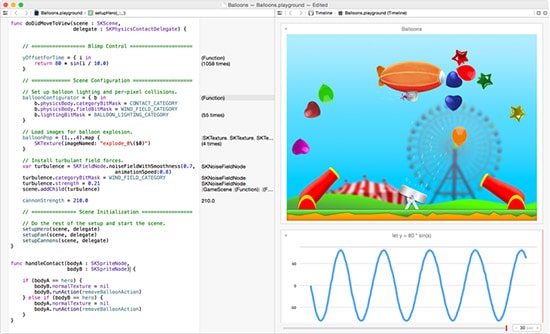
Swift is an innovative new programming language for Cocoa and Cocoa Touch.
More Video and Animation
As the digital community becomes more and more immersed in the multimedia experience, the natural shift towards video and animation will continue. With that, we move away from clunky text-based websites. Many would like to argue that the written word will never lose its value (and that is very likely true). But it’s becoming apparent (with numerous great examples from recent years) that combining good copy with video and animation is the superior solution.
Simply put, the visual element allows designers to produce a much stronger emotional effect. It also helps build a more personal connection with the visitor and aids in engaging and telling the story. Storytelling is still a huge trend in content marketing for 2015.
Whether just an embedded video on a home page or a video background, the effects for the website and its message are be profound.
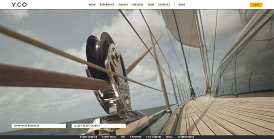
Y.CO uses video as a background.
Emerging New Design Languages
In 2014, we saw Google’s Android release Material Design – a new design guideline for the Android L. The underlying aim of Material Design is to combine the tactility and texture of ink and paper with the essence of digital. The design outcomes could be nothing short of phenomenal.
Material Design will lead the way in 2015 but others will surely follow. Think responsive design, bold images, surprising and vibrant colours, artistic use of light and shade, creative typography, and fluid animation and touch transitions. All of this on any screen size, eliminating Android issues of the past.
Focused Designs
With analytics being as prominent as ever, it’s hardly surprising that branding continues to be completely intertwined with the web design process. It even evolves to the point that they are practically unimaginable without one another.
Web Design agencies need to spend 2015 concentrating on their clients’ branding as a whole and not as a separate item or after thought. From conception, the branding and web design need to present a united front and a consistent message. Tone of voice, content, imagery, navigation, style and functionality.
Your client claims to make their customers’ lives easier? Prove it – create a website that is fast and easy to use. Another client claims to be the modern choice? The style, images, language and layout give you a fantastic opportunity to build the brand, reputation and impression as soon as the site is clicked upon.
Focused designs will offer websites that make sense and a lasting association.
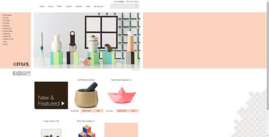
Focused design at Gretelhome.com
Unique Navigation Solutions
As you’ve probably noticed, over the last few years the navigation menu/bar concept has seen a lot of changes. Designers have been looking for better, easier to use, and/or more interesting ways to help the visitor browse a website. All of that has led to many unique solutions.
Many web design trends failed. Some served only a specific niche but some have recently hit the mark and we expect these to become more prevalent in 2015. Think about floating and sticking menus, navigation in an unexpected but upfront position. Navigation in 2015 will continue to evolve to be innovative but also mobile responsive. With the usage of mobile devices, you’d be silly not to ensure your navigation works, regardless of your visitors’ device.
Summary
The web design world is changing as fast as it ever has. New concepts, the changing landscape of the market and increasingly demanding customer expectations are forcing designers to try and come up with new and exciting ways to present information to the online audience.
The entire industry is quickly shifting towards ease of use, not only for the user, but for the designers as well. It has become all about efficiency and strength of message. It means that everything put out online has to be not only well-targeted, but also on point and convincing enough to get attention.
With all the web design trends that will come and go throughout 2015 there is one that has everyone in agreement – mobile first. If you ensure that your website is designed and implemented to appeal and work for mobile device users; you’re half way there already.
What you should read next


Thanks Shayne! I’m your new biggest fan! Please keep creating more great posts. They’re really worth sharing and insightful.
Thanks for sharing this Shayne! Having this blog post keeps me in track of what are the latest trends in the web design industry this year. I also found another article from an influencer and I can’t help but share this
http://www.1stwebdesigner.com/graphic-web-design-trends-2015. A good addition to my web design topic list. Thanks again!