Why do Passwords Appear as Dots in a Form?
When I want to subscribe myself for a newsletter, website, online application or want to sign in, I need to put in my password. This is the easiest way to protect websites/applications and it works, but what I really don’t understand is why passwords appear as dots in the textfield.
To me this is against the basics of user friendlyness because people need to see a clear result of their action, eg. a keystroke. This way you can’t know which dot represents which character (unless you start to count), so there is a possibility that you made a typo in the password. Of course this can be simply overcome with a second textfield which checks if both passwords are the same, but what happens if you copied the first password and paste it in the second textfield? Your subscription is send of for confirmation with the wrong password.
It’s been encouraged to make your passwords longer (8-16 characters) and to use combinations of different characters (abc – 123 – ?!), otherwise the form will not be send away. These kind of demands make it even more difficult to avoid typos. Although I understand that you can’t put just anything in the textfield and you should think this over carefully, that doesn’t mean it can’t be done in a user friendly manner.
The more I think about it, the more I wonder why and when these dots appeared for the first time… I guess it was in the ’90 when only one person had a pc and had to share it with the rest of the village. Whenever the user switched the power on, the others were watching as well, out of curiosity. Back then they had to find a way to scramble the password while typing it into the textfield to keep it a secret. All stupidity aside, this could have been a nice story, no?
The obvious reason why we still set the password field as dots, is security… we didn’t want people to have a peek in the ’90 and we still don’t allow it now. The computers are getting smaller with the year and what started out as a computer for the entire village is now a small electronic device inside your pocket. The pc has never been more personal than now, making the peeking-over-your-shoulder story less likely.
The solution
The easiest solution would be to change the textfield to ‘text’ instead of ‘password’. As I can imagine that this solution is too much for many developpers I have another suggestion found on the website of dynamicdrive.com. For this solution you can keep your textfield as dots but you include a small button next to this textfield saying “switch to text”. With the help of javascript you can change the state of your textfield from ‘password’ to ‘text’, meaning from dots to normal text. This way you can check your password before submitting the form and you don’t need a second password field.
This solutions seems to work just fine but it has its flaws. First of all it requires an extra click from the user which can be annoying for those who go through forms with the tab key. Secondly, what if you checked your password by pushing the button and forgot to change it back to password mode?
For this reason I came up with another idea, no unnecessary clicks and easier to go through the form. The status of the text field is set to ‘password’, but once you enter it with the tab key or mouse click the status is changed to ‘text’ which makes your password readable. When you leave the text field, the status is changed back to ‘password’, making your password again unreadable. Unfortunately, after two days of coding I still didn’t get the result I was hoping for. After searching on the web I’ve found an example made by viget.com.
I would have liked to put the example in this post but it was conflicting with the current version of jquery.
I’ve tried the code in different browsers and it works in Internet Explorer (6,7 and 8), Firefox, Safari and Google Chrome. Special thanks to the people of viget.com
UPDATE
I’ve been looking into free online mail applications and found mailchimp as a nice solution. Apparently mailchimp is using the second solution for the password-in-dots story. Have a look at the image below.
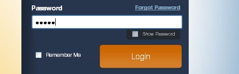
Mailchimp uses a checkbox to unveil the password.
Mailchimp prompts the user to fill in their password only once. With the help of a little checkbox, you can quicly unveil the password to check it for possible typo’s.


Although I think the dots are there for the clear reason of security. I would like to suggest this solution.
My solution is to do it the way many bluetooth applications handle this (while intering the pairing code). They still use the dots but display the last typed letter as text. So there is no extra click required.
h
*e
**l
***l
****o
This one slipped my mind, I’ve seen it before though and is a nice solution as well. I think apple implemented this in the iphone?
Interesting. This issue was raised by Jakob Nielsen not so long ago as well. I think for registration forms this could be fine as these are usually done in private. Logging in though can happen a lot in public so for login forms it’s probably best to conceal the password or at least have it concealed by default.
One other thing to note is that text fields by default would remember previously entered data (unlike password fields, which are populated by browser’s password manager), so you need to explicitly turn off auto-complete, otherwise your password may be revealed next time someone types something starting with the same letter.
Interesting point on the auto-complete dmitry, didn’t think of that one. I think that the solution, which was shown to us by Kristof, improves the usability but also upholds the safety of the entire operation (be it for a quick login or filling in a long form), this without an extra click.
I’ve found a working example, written by Stephen Lewis. Although it works in FF, it seems to fail in IE7. With every keystroke, the amount of digits is doubled. I’m still on the lookout for a perfectly working example.
Very interesting article. Very informative also. This question also slipped my mind. Thanks to share this awesome article. Really now i got some clear idea now. :)
The dots are there for security, so someone looking over your shoulder can’t find out your password (social engineering hacks).
In our software program, when you enter a password, such as for your key, it’s in all dots. But there’s a check box you can select that allows you to “Show keystrokes.” If you know no one is at your back, you can select this to verify you’ve typed the correct password. In our case, it’s a simple usability fix. :)
I’ve heard this a gazillion times. “Why mask passwords? Give control back to the users!”
There are various reasons why this is not a good idea.
1) You may think that “over the shoulder” password peeking doesn’t occur anymore, but it’s far more likely to happen now than ever. Be it your girlfriend trying to figure out your Facebook password to see if you’re cheating, or the florist that brought flowers to your office who is really a corporate spy. No this is not a movie script. This stuff does happen.
2) It has worked the way it is for ages. Why change something that works? Most people authenticate many different ways. Browser’s password manager, a password managing app, the leave their account logged in, or are so used to typing their password that muscle memory takes care of the rest. Is it really that hard to type a string of 8 to 13 characters correctly?
3) Users grew up with the idea that masked passwords mean security. You take that away and people will think twice about using your website. Though password masking does not equal security, it’s to late to change the perception of it all.
There’s a point where usability pioneering starts getting in the way. Study the effects of positioning, whitespace, simplicity and complexity in interfaces, call to action importance hierarchies, and the whole plethora of other usability issues; but really, this stuff works well already, and changing it will make you the outcast in the list of sites the user uses. If out of the 10 sites I use 9 mask passwords and 1 doesn’t, I might associate that with not being safe or meaning something completely different to what it would mean otherwise.
To finish up, one of the most important concepts in user experience is consistency, and this doesn’t only apply to the design of your site. It is just as important to maintain a consistency in certain elements the user interacts with throughout the whole web, and one of said components is the password field.
@Jaime:
First of all, thank you for your comment. It is always nice to hear someone else’s opinion and takes the time to clarify it. I must say I partly agree with your comment. You shouldn’t change the usability of something that is so standarized as the dots of a password field, but that doesn’t mean there is no room for improvement (or at least have a look for other possibilities for that matter). Re-inventing the wheel is not necessary, but improving it to the changing external conditions without touching the basics of the wheel (it needs to roll) is. The essence of a password field are the dots itself, without these the field is not recognisable as a passform field. In all the alternatives mentioned in this article I kept the dots for consistency reasons. I do understand the solution of Apple, changing the character in a dot after you entered the next character makes sense. People still recognise it as a passform field, it is still consistent and it’s more difficult to make a typo. I’m not saying that this option will be the new standard, but it is nice to know that people still think about the functionality.
@Paul Olyslager: Thanks Paul! I by no chance mean there should not be room for improvement. I do agree that if there’s a chance to improve, so it shall be done in a tasteful and effective way. The thing is, a password input box that displays the letter and then transforms to a asterisk, is just a bit more safe than having the box display plaintext. A person with good visual ability and memory looking to steal your password will do so by looking at your plain text, by looking ad the changing letters, or by looking at your fingers when you type. In that same order you could say there’s no protection with the first, somewhat a protection with the second and as much a protection with the last option. The main reason the iphone’s password input boxes work like that is because of two reasons. First the fact that the phone is always in close proximity to your person and it’s easier to “protect” your password entering with your body (which most people do, if only because most people use the phone in a position where people can’t snoop from behind). And Second the fact that typing in an iphone is by definition harder than typing on a regular keyboard, as well as it’s a lot more error prone. Add to that the fact that if I can probably type my password wrongly 2 times and get it the third time on the browser faster than typing it on an iphone (though that might be because I really don’t get a lot of use from opposable thumbs). It’s that much annoying to have to retype your password on the phone than on a laptop or desktop. I believe Apple decided to sacrifice a little security to make the experience easier for people. But we shouldn’t do that on the web, because the security risk is a lot higher than on a mobile phone.
I’ve found a nice solution for the Iphone-like approach on the website of Queridodesign. It is using Mootools and works in Safari 3+, Firefox 3+, Opera 10+, Internet Explorer 6 and 7.
This is a really good article =) save me a lot of time with research… thanks mate..
@Marco Monteiro: You’re most welcome Marco! Glad you liked it.
Hi, I don’t know if this article/discussion is recent or archived but found it extremely interesting. A point that all your replies seem to be missing is how useful it would be for disabled people like me with poor dexterity (cerebral palsy) Jamie posed the question “Is it really that hard to type a string of 8 to 13 characters correctly?” Believe me Jamie for some of us its very difficult. I’m forttunate enough to be able to type one finger. Others, my wife for example, co-ordination and use of hands so bad she can only type with the tip of her nose!! So anything that makes the process a bit easier is appreciated.
(to make a point… this messaage has taken well over half hour to write and involved 32 corrections).
Hi Clive, thank you so much for making your point. I think that comments like these are a real eye-opener for all of us. I have to admit that many companies I have worked with value accessibility as a nice-to-have rather than a must-have because the necessary investments don’t weigh up to the minimal increase of users.
Little do these companies know, literally! They seem to claim that their websites or applications aren’t used by people with disabilities, so they don’t need to pay attention to web accessibility. However, the tracked profile of a user with a disability is identical to anybody else using that browser.
Knowing that 18.7 percent of US citizens are disabled (according to a 2005 report from the United States Census Bureau), they should start right away!
I haven’t found any metrics on the matter but I do believe that many, mostly governmental, instances are making the extra efford – although slowly – in optimizing their websites, (web) applications, … but companies and others still have to follow their example.
when i put in my password in my laptop, aby key brings the dots up and always too many so i cant get in my pc
Ahm , what company/companies that are not using dots to make passwords unreadable .??? Instead they let words be readable to users when putting datas
Interesting blog. As I was researching some password inputs for a blog of mine not so long ago, I was having the same idea with Kristof Van Roy, although I doubt anyone would pay attention to it.
Nonetheless, I believe good password habits and being well-aware of how easily your password can be stolen in a public place are the right solutions for this.
As a side note, I wrote an article featuring some Polymer based password field web components. There are a feature comparison table and a compatibility table with different platforms as well.
https://vaadin.com/blog/top-five-web-components-for-password-inp-1
Password entry on my computer keyboard is very frustrating when I can’t see what I’ve typed. On my phone or tablet it’s much harder. My fingers are big and my hands often shake or bounce typing the same characters two or three times. On the computer. I can type the password, select it, right click it, select “Inspect”, change “password” to “text”, and the box where I had typed the password appears as readable text.