Mind Games: Psychology in Webshop Design
Human lives are mostly driven by emotions and impressions. Politics, marketers and PR-specialists, for example make a living from ruling emotions and opinions. Psychologists say that in order to gently push a person to some decision, you can affect any of the five sensor systems.
For instance think of the smell of fresh bakery in the supermarket; it’s so tempting that you head to get a bun even when it’s not on your shopping list.
Pretty much the same results can be achieved for webshops with the help of small design tricks. So what exactly makes the human mind tick?
Obviously, visual appearance means a lot more for people than any other sensor information. Turn to your webstore and try to look at it through your customers’ eyes. You should not only estimate the quality of pictures, but take a look at the very structure of your webshop. Of course, as a business owner you aim to tell about your products and services as much as possible; but people are drawn to simple and obvious things. Too many choices brings confusion. This feature of the brain is mathematically proved by Hick’s law. Too many options to choose from – no final decision.
Perhaps something like that has happened in your everyday life. Try to recall the moment when you were choosing a new sell phone to buy. You searched the Internet for reviews and discussed different models with friends over and over again, continuously putting off the actual purchase. You go completely out of your mind.
Too many links, ads, shipping and payment options are confusing and overwhelming; customers feel tense and abandon their carts. What can you do about it? Make your site minimalistic and intuitive, cut down on products and options that are used rarely. Make a small experiment and change the design of just a couple of pages, you’ll see that minimum works better!
The menu
Navigational menus come in handy if you provide lots of options for your customers to choose from and nothing can be left out. Hidden menus or so called hamburger menus will demonstrate all possible options, take visitors directly where they want to go and save space on the webpage. Remember how handy and intuitive such menus were for web applications? Make the same thing for web design! If you are not sure whether switching to hamburger menus is be beneficial for your site, let’s turn to ConvertionXL experiment. They tested 3 different types of hamburger menus:
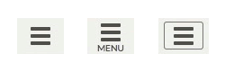
One of those icons included the word “Menu” and was done in pink color to attract more users’ attention.
The test ran for month and a half. During this time, the site was visited by approximately 240.000 users. Each type of icon showed pretty much the same result, which in all cases was better than their original text menu.
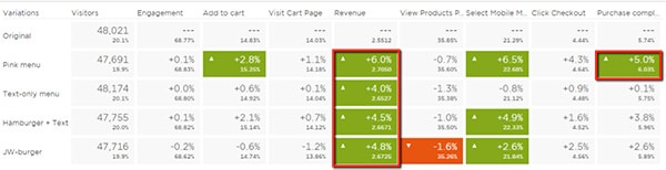
Results of the hamburger icon test.
Nevertheless other tests claim that this type of menu is not all that good and users don’t always recognize that it’s a clickable element. Perhaps the best thing to do for a store owner is to run a test and develop personal opinion. The result may depend on many factors like, for example how used your visitors are for such icons, how conservative they are and what type of device they use to browse the Internet.
Typography
A unique style of typography can represent your brand just as good as the logo. Font type and size can indicate who you are and make an impression of serious and large business or fun and pleasant service for example. You can obtain two goals with this one step: gently engage emotions and associative arrays plus help clients identify you in a glance. Be sure that the font you choose is applicable and looks right in all browsers and devices. Also consider increasing the size of your font. Shopping should be a relaxing process, and reading text of small font is quite overwhelming and can cause headaches. Visitors won’t stay long, if they feel uncomfortable.
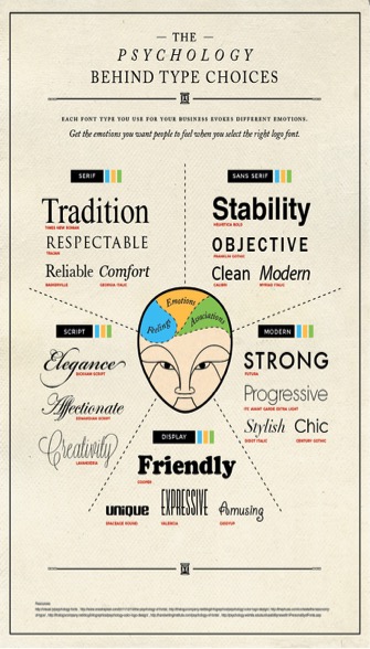
The Psychology behind type choices – by CrazyEgg.
John Paul Mains shares the experiment of one of his clients. The results were impressive; conversion rates greatly improved after enlarging font size only by 3 px (from 10 to 13).
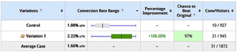
The variation is showing up as the clear winner.
Keep it simple, shift to flat design. Flat design is a lot easier to comprehend for users; it brings clear website structure. Severe and clear images sink into human mind; customer will subconsciously remember your brand and products of interest. A cluttered up room makes visitors nervous and claustrophobic, and a filled up webpage makes viewers disoriented and drags their attention to multiple different elements without concentrating on the main points.
Psychologists claim that human attention is a constantly allocated limited resource. Attention is also selective; while totally aware of one thing, a person could be figuratively blind to everything else. In another case viewers will try to grasp everything on your page at a glance, though nothing in particular would stick in mind in the end. Think about times when you go to some news sites for a weather forecast. Headlines, pictures, videos are all over the place. You click on something, than move to related materials and roll on to the most viewed. Eventually you can simply lose track of time in the flow of information and never look at the weather report. Minimalism of flat designs becomes a key to avoid such frustration. Furthermore, avoiding intricate design elements greatly improves site performance and loading speed.
Easy with the social icons
Ground social icons. Perhaps this sounds strange to you. Everybody talks about the importance of going social and being closer to your audience, so what is wrong with placing the icons? Position is what matters most in this case. Take a second to think of it; those buttons are all call-to-action (like, share and so on). And they take your customers from your site to external resources, which is not what you want to happen. You want people to surf just your site, learn about your products, services and company. Don’t let the audience get distracted, move social icons to the bottom of the site.
Build trust
Build up trust on a subconscious level. Of course you want to give customers and idea that you are reliable and it’s totally safe to do business with you. What tools do you use for that; huge “About us” text? There is a better way! Show awards, guarantees and other trust indicators right on the site! Be creative in it; for instance, you can make infographics out of trust and certificates to place it in the bottom of the site. See, just minimum words, only ideas and emotions!
Thoughts and opinions of different people are also a good trigger for trust. Don’t hesitate to show reviews on your products and services, you can even make a nice looking carousel for the main page. Be careful though; reviews truly can make your business or break it, if you post fakes or cover negatives. Too bright and positive comments catch an eye and cast doubts on your integrity, instead of creating subconscious confidence. It’s hard to keep balance, but it’s really worth the effort!
Mobile is the word
Nowadays more and more people prefer tablets and smartphones to computers and laptops. Actually, computers are used mostly for work; communication, entertainment and shopping flow comes from mobile devices. If you don’t have a mobile layout of your store, it’s time to make it. Call-to-action button and promo-signs within a “thumb-reach” will affect the sales dramatically! You should be sure that all clickable elements are in the comfortable green zone. Unreachable areas could be filled with static blocks of pictures and text.
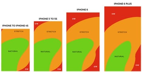
Clickable elements on touch devices – image by Core 77.
Buttons and colors
Speaking of buttons and signs, what colors do you use for those? It’s not just a matter of looking good with the main theme of a webshop or personal preferences. Turn to the psychology of color to make it work right and catalyze more purchases. Here are some tips on how color affects emotions:
- Red – urgency, energy, power, sexual desire;
- Orange – enthusiasm, creativity, strength, youth;
- Yellow – warmth, optimism, friendliness;
- Green – peacefulness, growth, safety;
- Blue – dependability, stability, loyalty;
- Violet – wisdom, mysticism, imagination;
- Black and white – simple, elegant, striking. Great in combo!
Consider wise usage of colors not only for buttons, but also for logos. Here are some examples of well-known symbols and what they unconsciously mean. There is a wonderful Entrepreneur article to help you find out more.
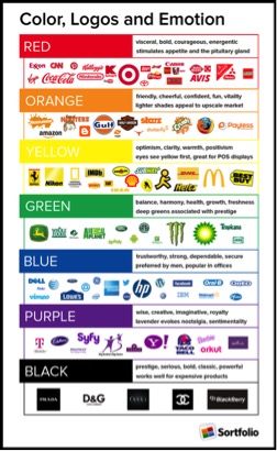
Color in logos – image by ConceptDrop.
Keep in mind that men prefer bright colors and don’t pay attention to color values; women like soft colors more and color shades are meaningful for them. Thus the color scheme of your site should be selected depending on your targeted audience.
Remember that it takes about 90 seconds to form an opinion on a particular product and take a preliminary decision on whether to make a purchase. 62-90% of that choice is determined by color alone.
Have these in mind while creating visual content! Besides you can implement some modern design trends of 2015 to make your webstore unique and memorable. In e-commerce only visual appearance can be used to pull some positive triggers in your client’s mind and persuade to take action and buy.


No responses yet to “Mind Games: Psychology in Webshop Design”