5 Quick and Easy Ways to Improve your Website’s Usability
The ultimate goal of usability tests is to obtain the necessary information which will give you the possibility to make an interface so simple and intuitive in use that people can work with it without thinking. People who navigate through your application shouldn’t be spending too much time figuring out the different functionalities of it.
In this article I show you how to discover the most prominent interface problems of your website and improve your website’s usability by following five simple tips. Remember: getting to know the problem is only half the work, you still need to interpret the results, make the improvements and test again.
User testing
Don’t wait with conducting user tests ’till you’ve finished designing your website, you should already do these in the wireframe-stage (a non-graphical layout) of your design. That is exactly the reason why I’ve put this tip as number one on the list.
First of all, don’t be alarmed with the term of user testing. Normally it is very time consuming and it can take quite a lot of preparation but this post is all about the easy way.
Take 5 to 10 people, family, friends or neighbours and split them up into 3 groups: the low, intermediate and high experienced internet user. The reason is that these groups have different expectations of a website, its functionalities and looks and it is likely to find more problems.

You will need to conduct the test in two steps. The first step is to listen to what your users have to say while exploring your website, ask them to speak out load and don’t try to guide them in any way. Give people the time to understand what your website is all about.
Ask simple questions, let them explain why they pushed a button and if the result corresponded with the idea they had in mind. You will need to figure out how and why they are using the application.
For the second step you need to give your users some easy tasks. Let them sign up for your RSS-feed if you have one, navigate to a certain page and post a comment, … Have a look how the user is trying to solve your assignments. Does he or she take a long time to find what was asked for? Did he or she reached the result in a way you intended it to be found? Don’t forget to take notes!
Keep in mind that it is completely irrelevant how you see your own website. You know how it works because you’ve designed it, but first time users have no clue what it is all about. You need to acknowledge that the user is not like you and have different expectations of a website. By conducting some simple user-tests you can find most of your website’s usability problems.
Jeff Sauro of Measuring Usability wrote a very interesting article why five users should be sufficient to find most of your interface problems. But remember: one user is better than none at all!
The Five Second Test
If you can’t find 5 to 10 people (or even one), you should consider the website of fivesecondtest. It allows you to create two different user tests by uploading a screenshot of your webpage.
The first test is a memory test: users get 5 seconds to have a look at your screenshot and need to describe afterwards what they remembered.
In the second test, the user can click on the screenshot for a period of 5 seconds and can give a descriptive text on each point. The results are shown in a handy heatmap-like overview which can be downloaded for further analyses. It is free and you can share these tests with your twitter friends.
Small Update: It seems that the makers of Five Second Test came up with another kind of test, named Navflow. By uploading several pages (simple print screens), you can track how people navigate through your application or website. At this moment Navflow consists of only two tests, so it is difficult to form an opinion which is backed up by results. I will get back to this as soon as possible.
Install a heatmap system
Heatmap tools allow you to record the click-behaviour of your visitors. This is an extremely useful and powerful tool to understand how people are using your website. Although installing a heatmap can be done in a matter of seconds, gathering information and making the changes will take a bit longer. Have a look at my article about heatmaps for some easy to install and free (or very cheap) heatmap systems.
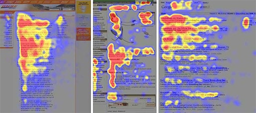
The F-shaped reading pattern by useit.com
Greyscale screenshot
Use any graphics editing program in which you can change a coloured screenshot into greyscale. The general ongoing rule was: the higher the contrast, the better the readability.
There is however a huge BUT in this story. Have you ever seen a banner with such a high colourcontrast (for example yellow text on a black background), that it didn’t feel comfortable to read it?
456 Berea Street wrote an intresting article about this phenomenon. Although it doesn’t provide you with a final solution, I’ve found that the next two rules always worked for me: stay away from the extreme colour contrasts between the design elements (max. 3 base colours and one colour to emphasize something) and use the white space wisely (don’t fill every white pixel with a colour).
If you do not have photoshop or any other program installed, you can visit the website of checkmycolours. It will give you a very detailed overview of the colours you’ve used in your interface.
5 pixels blur screenshot
This last tip is a very easy one and although the results can be seen as untrustworthy, it does make a small difference. Make a screenshot of your website, add a 5 pixel blur in your favourite graphics editing program and have a look what is really visible and what not. The most important parts, such as call-to-action-buttons, headers, company name/logo etc, should be visible.
As said, this doesn’t look like a trustworthy tip, but you would be surprised how much you can learn from it. Some of the problems such as the colour contrast and the use of whitespace can be found this way.
If you have any other tips to improve usability, please feel free to share them.


loved this blog post!
@3DTV Informer:
Nice read Paul. I’ve just tried the 5% blur technique in Adobe but you can’t specify percentages, only pixels. Any idea how many pixels a 5% blur effect would be?
@usabilitygal: Hi Lisa, just wanted to thank you for letting me know that I made a mistake :). It should be pixels and not percentages. By the way, love your articles.
I use clicktail, it helps me know what is happening on my site and its heatmaps and videos show me i can increase my conversions
@Paul Olyslager:
Aaah ok makes sense now. Thanks a lot for the compliment – good to know people are reading and enjoying my blog :D
Btw another trick I’ve come across for the blur effect is to close your eyes so you can only just see, then check out what stands out on the screen and what doesn’t. Your CTAs should still stand out, though they’ll be a bit blurry! If they don’t stand out, they’re probably not large enough or need to be a more contrasting colour.
@sara: Hi Sara, thanks for the comment. I’ve used Clicktale (free try-out) a long time ago but was not very satisfied with the usability of the application. Maybe I should give it another try and see if they made some improvements! Thanks for the tip!
What do you think about doing remote usability testing with narrated video on wireframes? At trymyui.com we’re thinking of launching a lower-cost service just for testing during the wireframe stage. For example, you upload your (clickable) wireframes and specify the tasks you’re interested in – we dispatch it to our testers in the demographics you specify, and we record them as they comment on the wireframes while they are performing the tasks. You would receive a 5-minute video of their interactions. Is this something that is interesting?
If your or a reader is interested in running some free samples and seeing how it all works out, please contact me via the feedback on our website and let me know. Thanks.
5 quick and easy ways to improve your website’s usability http://bit.ly/gx0Xhb #webdesign #webdev #usability
The pixel test looks interesting im going to try this soon.
Paul, thanks for sharing this article! Discussions are helpful too!
Great article. And some good tips.
Better UX enhances the website usability. The visibility of pages and their functional comfort are important to maintain for viewers. User testing makes a website launch pretty compelling. The website evaluation to know a number of users clicking it and following the services is a must!
Thanks Paul, great post. Many web designers ignore the whole testing phase no knowing testing is one of the most important phases.
May I also suggest our service which is focused on giving real feedback by one of our web designers. http://qualitycheck.website
Our web designers will help you find alignment problems, hidden problems on mobiles and tablets, usability problems, simply anything we think that needs fixing.
These UX design tips will help you find out the key elements that will make your design click with your target audience and make it useful for both you and the users to interact.