What Data do you need for Data Driven Design?
Using data to drive design is relatively easy to encourage people to “like”. When I speak about how I use data to help designers make decisions, I tend to see people nod and look interested. But, it still takes a lot of steps from “interest” to “application”.
I don’t think interest is the problem behind the low rate of getting design teams to do research – what I often get asked is “how do you actually use data for design?”
What data do you actually use for data driven design?
I’ve been working with data since I started working. I was a quantitative research analyst, then a qualitative research analyst before I moved to design research and used digital analytics. So, believe me, I get the confusion. Technically, everything is a data point.
Comments are a data point. So are pageviews, time spent, mobile phone usage, customer satisfaction surveys, sales and conversion. All data points.
So which ones are useful for improving app and website design? (I’ll focus on app and website design for today so we have a clearer focus.)
Also read: 3 Surprises from Combining Qualitative and Quantitative Research
Organizing what you want to measure
The “user experience” of a digital product consists of many elements, as illustrated by numerous models about what User Experience is.
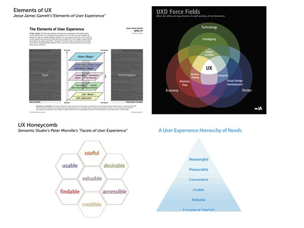
UX Models
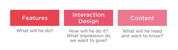
When I look at a project, I usually try to break them down into three main categories as – what is it doing, what is it saying and how does it look and move.
Figuring out Areas of “Improvement”
Data driven design is all about optimization – about “improving” what you put out.
And this can be in one of the three main consumer-facing areas: Features, Interface and interaction design or Content.
Technical Performance — speed — is also a critical digital attribute that you could use data for, however, I will focus more on the design and product aspects, rather than engineering.
Now that you know the different general areas of improvement, set out to find which data points you can use to track the performance of each.
Features (for Product Management)
Usage (or lack of it)
If you want to optimize the feature set of your product, begin to track how often your current roster of features are being used. In Google analytics or app tracking, this will most probably be through events. If you’re doing usability testing, you could validate this with live observation.
Need or claimed demand
It could go without saying that the highest usage features, would also be the most “in-demand”. But, you could also validate this by maximizing your “earned media”. Scour through your app store or social media comments and customer concerns to have some qualitative dimension to the usage data that you’re also gathering. A cheap way to do this is to look at Search data.
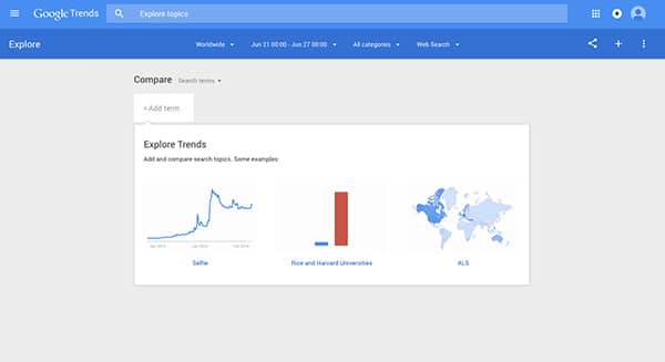
Google Trends
For example, I recently looked at Google search data to check which government services are looked for most in my country – which product managers and designers can now use to prioritize features for redesigned government websites. For your apps or websites where you are exploring use cases or information hierarchy, you could use this sort of information to see how your audience naturally thinks about your service or brand, and what they look for.
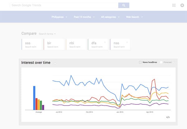
Philippine Government Services Google Trends
Interface and Interaction Design
Flow
The most critical thing for me in checking out how pages are working, and working together – is checking out the Behavior flow section in Google Analytics. It lets you figure out the current way that people move through your pages. The in-page analytics also helps when figuring out how people navigate within the page.
Paid click-tracking tools and programs such as CrazyEgg, Optimizely, and Usabilia organize and present this sort of information in a more automated way. When you do usability testing, this is something you look out for as well – how people navigate in-between and within screens.
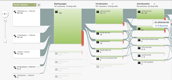
Google Analytics Behavior Flow
When you see the little hiccups in how they do tasks (i.e. workarounds and errors), they are your sources of inspiration in improving how those particular functions flow. For example, if you see people repeatedly failing to see an error notification, or a required field, what could you do to the interface design to highlight that notification or label?
Content
Traffic: Do people actually look at this content?
There are many ways to measure this, and this is also frequently discussed by content strategists. You could do a content audit, and also look at your analytics performance and heatmaps to figure out which pieces of writing, photography or video are working for your product. Traffic can point you to which elements on your website are most effective, or most visible.
Traction: Are people finding this content relevant?
For me, this is the deeper metric. If you can use traction to measure and optimize your content, the better. Traction meaning people’s relationship to the content: are they reacting to it, sharing it, are they moved to action because of it, do they convert? An example of “traction”, would be how Medium structures its metrics – where they prioritize “reads” and a read-ratio, and “recommends”, alongside pageviews.
Tailor-fitting
These would be the main areas of data that you would need to look at if you set out to optimize a design. Each project is different, so examine what data points you would need to check how your features are doing, how your design is doing, and how your content is doing. That’s the first step to kicking-off data driven design.


No responses yet to “What Data do you need for Data Driven Design?”