All About the Heuristic Evaluation
A heuristic evaluation is a fast and cheap process to improve your site’s usability. Personally, I found that it helps to optimize silly and obvious mistakes which, when fixed, make for a much better overall experience. You’ll find that these evaluations are simple to do and I urge you to embrace them and use them as often as possible because you will never catch everything at a single glance.
What is a heuristic evaluation?
A heuristic evaluation is usability inspection method to identify usability problems in the user interface (UI) design. It is by far the most popular of usability methods because it’s so simple to perform but crucial in finding bugs. Think of it as an inspection of the design you currently have.
The overall goal of a heuristic evaluation is to find bugs and fix them as part of a iterative design process; they are used to find gaps that could interfere with the end-user’s progress. Evaluations are usually performed by multiple people, but individually. That means they’re unbiased, which result in finding more bugs. I find it helpful to evaluate a website every few months with only a few people at a time – always a new set of users. It’s quick and effective as it helps identify things which you may have missed.
Background of a heuristic evaluation
The evaluation process came about 1990 by Jakob Nielsen, who was looking for a quick solution to test computer software. User testing was extremely difficult and costly at that time. In order to user test, you often had to train people to use the software which was an awful burden.

An evaluator conducting a usability test.
Jakob developed this method over years and has defined 10 rules of thumb, hence heuristic, that are guidelines for the evaluators to stick by. Back in the day, there was no such thing as UX or conventions for that matter. Heuristic evaluations have been at the very beginning of user centered projects.
And what’s the purpose of a heuristic evaluation
Like I’ve mentioned, a heuristic evaluation is quick and dirty way to figure out what needs to get fixed on your website, app or software project. You are not supposed to invest too much time or money into this method, which is what makes it so great. Think of it as a way to eliminate usability problems, and do so fast. A heuristic evaluation of a small to medium website, say up to 25 pages, would yield results and possible solutions within a day – possibly even before lunch. It also eliminates the need to schedule, organize and run user tests with actual users which can be a big hassle.
Advantages
- Fast and inexpensive feedback
- Different people identify different problems
- Obtain feedback anytime throughout the design process
- Use it with other usability and user tests
Disadvantages
- Requires the evaluators to have some background/experience with usability
- Gathering multiple evaluators can be troublesome
What to look for?
There are ten heuristics that Jakob has outlined and modified over the years. The following ten have been copied right from his blog. Check out the original post, titled 10 Usability Heuristics. Within a test you should take note whether the issue occurred ones, multiple times, the entire time or was actually absent which then caused an issue.

A typical heuristic evaluation scorecard.
1. Visibility of system status
The system should always keep users informed about what is going on, through appropriate feedback within reasonable time.
2. Match between system and the real world
The system should speak the users’ language, with words, phrases and concepts familiar to the user, rather than system-oriented terms. Follow real-world conventions, making information appear in a natural and logical order.
3. User control and freedom
Users often choose system functions by mistake and will need a clearly marked “emergency exit” to leave the unwanted state without having to go through an extended dialogue. Support undo and redo.
4. Consistency and standards
Users should not have to wonder whether different words, situations, or actions mean the same thing. Follow platform conventions.
5. Error prevention
Even better than good error messages is a careful design which prevents a problem from occurring in the first place. Either eliminate error-prone conditions or check for them and present users with a confirmation option before they commit to the action.
6. Recognition rather than recall
Minimize the user’s memory load by making objects, actions, and options visible. The user should not have to remember information from one part of the dialogue to another. Instructions for use of the system should be visible or easily retrievable whenever appropriate.
7. Flexibility and efficiency of use
Accelerators -unseen by the novice user – may often speed up the interaction for the expert user such that the system can cater to both inexperienced and experienced users. Allow users to tailor frequent actions.
8. Aesthetic and minimalist design
Dialogues should not contain information which is irrelevant or rarely needed. Every extra unit of information in a dialogue competes with the relevant units of information and diminishes their relative visibility.
9. Help users recognize, diagnose, and recover from errors
Error messages should be expressed in plain language (no codes), precisely indicate the problem, and constructively suggest a solution.
10. Help and documentation
Even though it is better if the system can be used without documentation, it may be necessary to provide help and documentation. Any such information should be easy to search, focused on the user’s task, list concrete steps to be carried out, and not be too large.
How to conduct an heuristic evaluation
The process of an evaluation is simple, you have someone take a look at your project and jot down any and all issues they have come across. However, it is a bit more elaborate than that. You should always have the evaluators perform their evaluations separately so they are not pressured or biased on their findings.
It’s important that the findings are somehow recorded; the best way to go is to have the evaluators write them down as they go. Typically a session should last somewhere between 30 min to an hour. Of course the bigger the project, the longer it will take to go through it. If the projects is indeed big, have the evaluator do this in sections or sessions with breaks.
I will also strongly suggest that the evaluator have two walkthroughs. The first to get a feel of what is going on and then use the second one to note down all issues and problems. Additionally, you should rate everything you have found on a priority scale: fixed ASAP or not. All issues should be fixed though, I mean come on.
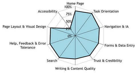
A radar plot showing a website that performs well in all areas but one.
Lastly, make sure that the issues are being documented thoroughly, note where it was found, what the issues was and what you didnt like about it. There is no need for an evaluator to come up with fixes for the issues, that’s the designer or developer’s job.
I’ll Conclude
I hope that this was a very short but straightforward introduction. I strongly urge you to try it out on your website. Every little bit of improvements – no matter how small – helps the user’s experience.
So go ahead, give it a try and let me know how these heuristic evaluations have helped you. I promise you’ll love it!
Editorial note: UserFocus made a great list of 247 web usability guidelines in an easy to follow excel workbook. It’s a great help for any heuristic evaluation.


That’s Jakob with a K. He’s Danish.
Hi Colin, I’ve changed it, thank you for that!