6 UI Rules You Should Never Break
The first membrane of every object or living being is the skin. Even a needle entering your body has to pass through the uppermost epidermis first. User Interface (UI in short) is that skin of the digital system via which we transact with it. But mind you, it’s neither the design nor the visual appeal of a system but its usability.
Let us take an illustration to understand what difference user interface can make to achieve an objective. Below are two screens depicting different ways of filling a registration form.
- Picture 1 shows different buttons for selecting an option. This format consumes a lot of screen space, eventually confusing the user.
- Picture 2 shows a drop-down list format for selecting an option. This projects a neat design and at the same time displays all the options within a category leaving no room for confusion.
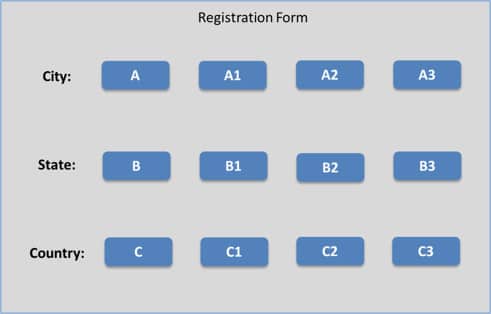
Distorted Design
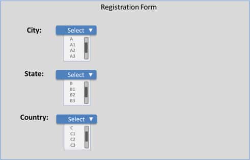
Organized UI Design
Classification of User Interface as a separate branch in software development lifecycle by itself proves the predominance of organized design over plain purpose fulfilling design. There exist some important design principles to make a system adaptive enough to suit every user’s taste and purpose.
1. Back and forth navigation options
Rely on cognitive design theory while deciding user interface elements for your system. A back and forward navigation option whether with or without pagination, for developers it would be simply different linking, but for users it will be highly convenient. Also, an undo option to revise user input will prove advantageous for both; saving users the pain of filling the entire form again and lesser load on the database.
As a rule of thumb, we place the back navigation on the left and forward navigation option on the right-hand side of the screen. It is always advisable to pursue wireframing as a practice before developing your designs.
With more dynamic designs on the rise, a flexible UI will create a better user experience.
2. Make it consistent
A screen is a conglomeration of many actionable items. Therefore, the best way of displaying things would be to select a pattern that maintains uniformity across the entire system. And this pattern is not just specific to a color scheme; it equally applies to operations deployed for similar actions.
Let me walk you through the basic steps of UI designing:
- List out all the actions of a system/screen/website.
- Now separate out actions that perform a similar function.
- Select a single UI element to display similar actions.
- Select a uniform alignment for UI elements.
- Use same fonts and similar wordings for all actions.
- If you are using a hover effect to display tooltips, it should be consistent.
It’s easier for users to construe consistent elements. Overwhelming designs using different UI elements for a single type of action will only confuse users. The example showed in Picture 2 illustrates this paradigm clearly; all the form items (city, state, country) use the same UI element –dropdown list, hence eliminating all scope of confusion. A UI which is easy to comprehend also saves you from creating descriptive help manuals and providing user trainings.
3. Leverage colors to project similar functions on a screen.
You can select any one color scheme for your screen. Generally preferred schemes are those with maximum contrast. A white background with black fonts or a dark background with white fonts is the most widely used contrast definitions. However, you can select any combination of your choice that does not hamper visibility.
When it comes to choosing colors, select a fixed color-code set for related items, for example, all forms open in a beige window with white background and black fonts will render uniformity. This way even if the user misses an event, his color memory will remind him of the action selected by him.
4. Use effective language
Brevity is the key while writing phrases and text for a screen. Convey optimum meaning through minimum words. Instead of informal expressions use accepted terminology that can be comprehended by all and sundry.
Also, check for consistency of your messages that are displayed. “Your input has been saved” and “Your input has not been saved due to server issues. Try again.” Both these messages are coherently worded. If the second message said “Your input could not be saved due to server issues. Try again.” It would convey the same meaning however this would not cohere with the first statement. Hence, proper wording of your labels and messages is crucial to gain user acceptance.
5. Make it accessible to all
Take into account people having reading disabilities while deciding colors in a design. Color blind people cannot identify all colors; if you are using an unidentifiable color for special effects use recognizable indicators.
During surfing a website or working with an application, it is a general habit to use either keyboard or mouse for all actions. Web sites that require usage of both the options in a single page cripples user comfort and eats up more time. To avoid this switching allow any one mode of input.
6. Consider all devices
The design you choose should be in context with the device. It would be invalid basing your system design on any one particular device. A 3 column design is appropriate for a wide computer screen and justifies the space and augments readability. But if the same website has to be viewed on a 5-inch smartphone, I am sure the outcome will not be as satisfying as the earlier one.
For this reason, insert attractive design elements on the top of your screen, which are light and load on all devices and in case of smaller devices where rest of the screen is not apparent, induce users to scroll down.
Sometimes design inspirations are adopted from others works, while some successfully produce the desired affect, other replications fade with time. Just ensure you follow the right design standards. Also, a blind inspiration has its own hazards that ensue multiplication of mistakes. And so don’t let your creativity conflict with the basic design principles. Balance creativity with usability.

What you should read next


Sorry, I can’t agree with you on the first set of diagrams, “Distorted Design” vs “Organized Design”. The special layout helps a lot, especially in mobile situations. The older “pull-down” design was invented specifically for a case when we needed to squeeze a lot of functionality in one line (the Menu line on Macintosh). This is legacy, especially in the sense of how ugly the drop-downs typically look, being of different width and covering some other (unneeded? unused?) areas of the page. I would very much like the newer OS to have a standard UI elements replacing pull-downs. Something like Dials on the radios (horizontally spinning discs, with a clear set marker in the middle, and all values rotating with some nice inertia and clicking into softly position. Yes I am skeuomorphic UI design adept. We need to mimic physical word because we know how it acts, subconsciously (e.g. Inertia, Hook’s law, Gravity etc). Hm, someone should use Gravity in UI…. have a look at a good example of “distorted design” and imagine this being a series of pull-downs instead…what’d you prefer? (Yes, the page realigns to new width when device is rotated)
For things like location it’s often easier to type in the information than selecting from a very long dropdown menu where people can get overwhelmed by a long list.